All Images
Imaging Software
Figure 1
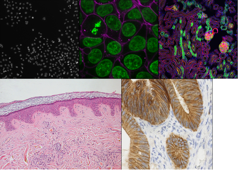
Figure 2
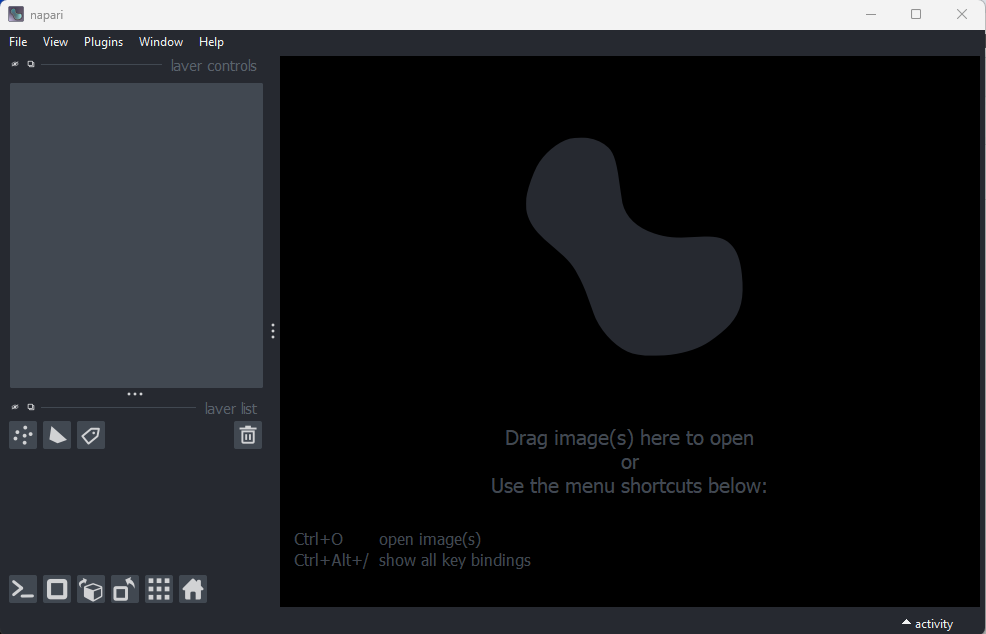
Figure 3
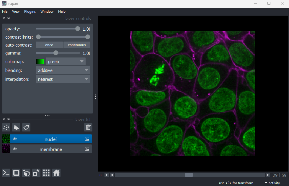
Figure 4
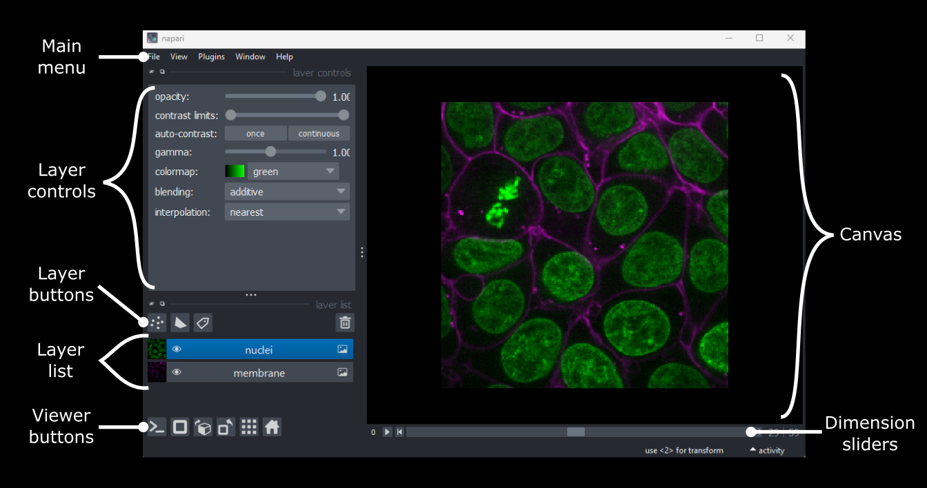
Figure 5
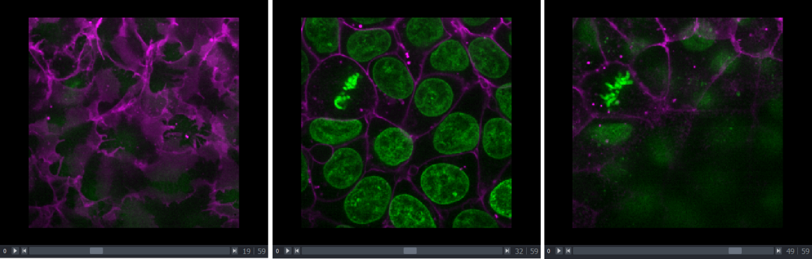
Figure 6

Figure 7
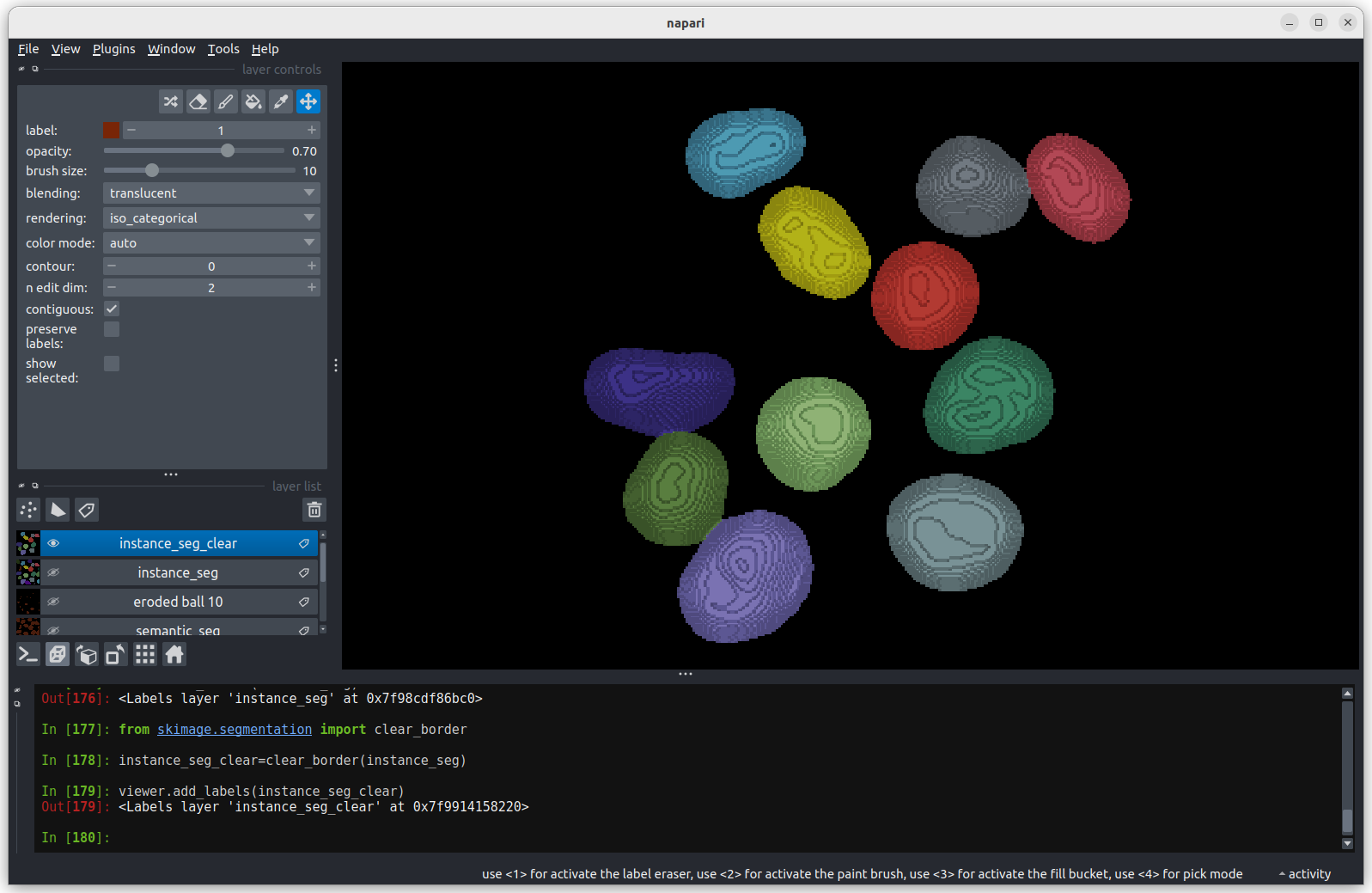
Console 
Figure 8
2D/3D  /
/ 
Figure 9
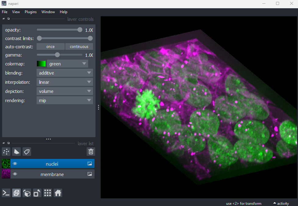
Figure 10
Roll dimensions 
Figure 11
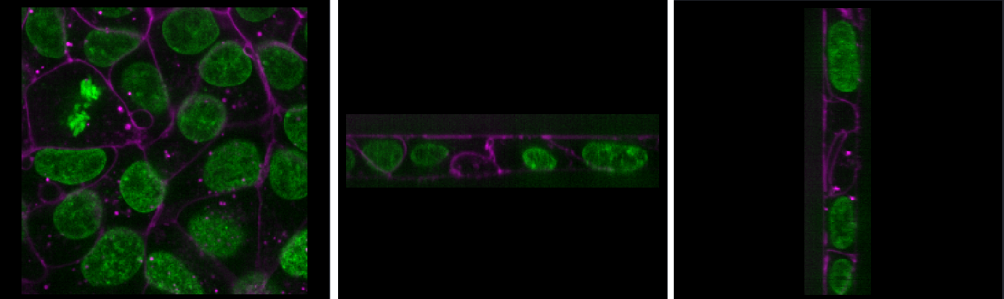
Figure 12
Transpose dimensions 
Figure 13
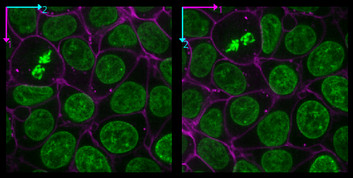
Figure 14
Grid 
Figure 15
Home 
Figure 16
Figure 17
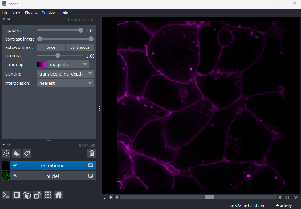
Figure 18
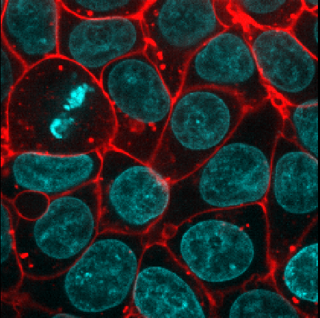
Figure 19
Points 
Figure 20
Shapes 
Figure 21
Labels 
Figure 22
Remove layer 
Figure 23
Figure 24

Figure 25

What is an image?
Figure 1
Press the remove layer button
Figure 2
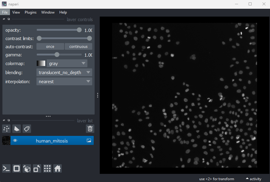
Figure 3
Figure 4
First, open Napari’s built-in Python console by pressing the console
button . Note
this can take a few seconds to open, so give it some time:
Figure 5
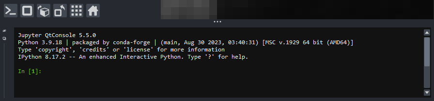
Figure 6
Note that you can also pop the console out into its own window by
clicking the small  icon on the left side.
Figure 7
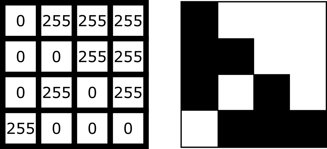
Figure 8
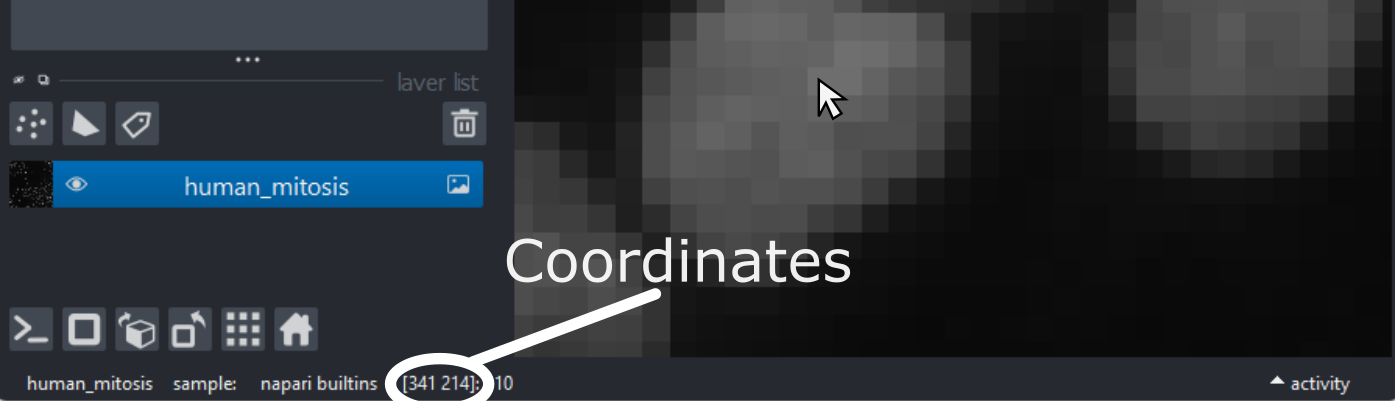
Figure 9
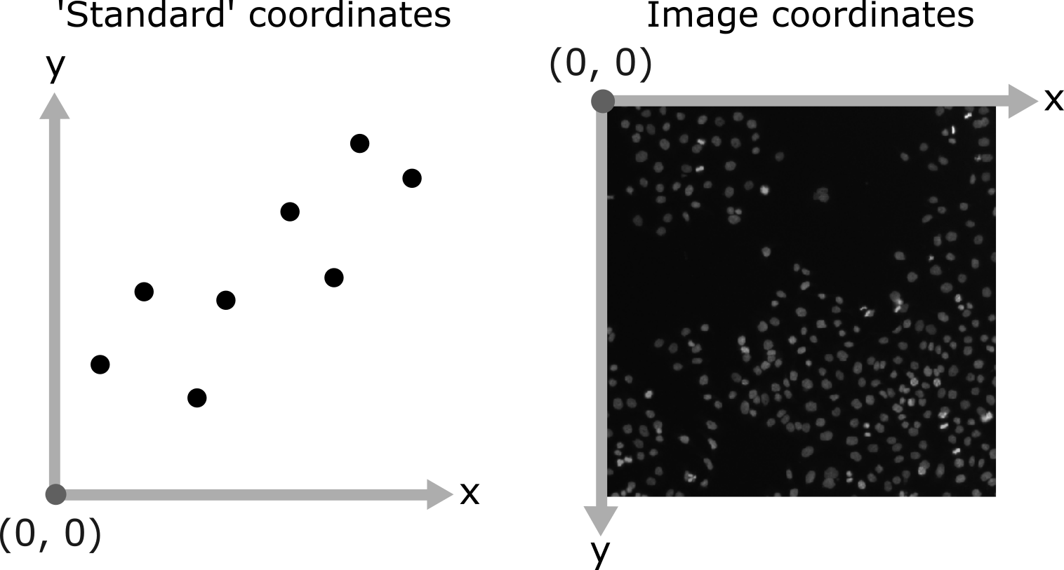
Figure 10
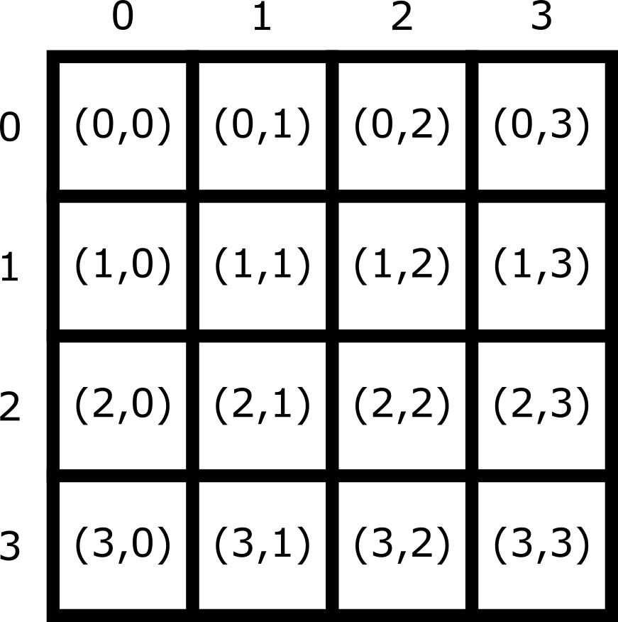
Image display
Figure 1
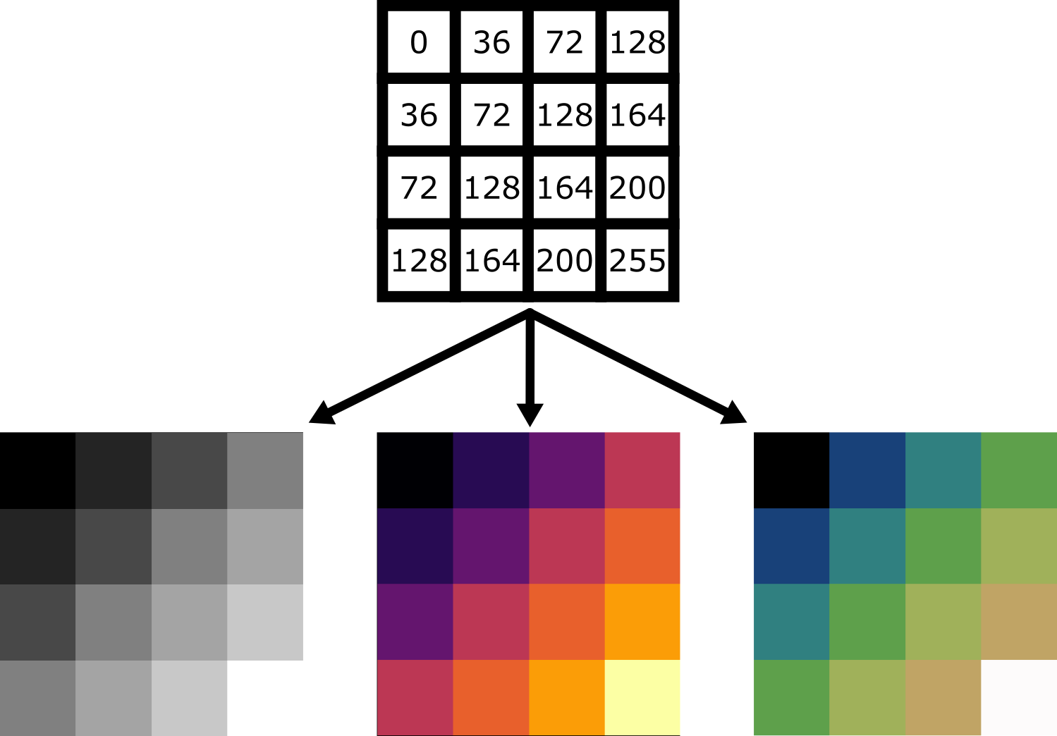
Figure 2
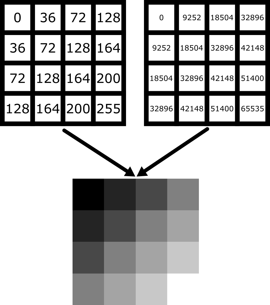
Figure 3
Figure 4
Figure 5
Figure 6
Figure 7
Figure 8
Figure 9
Figure 10

Figure 11
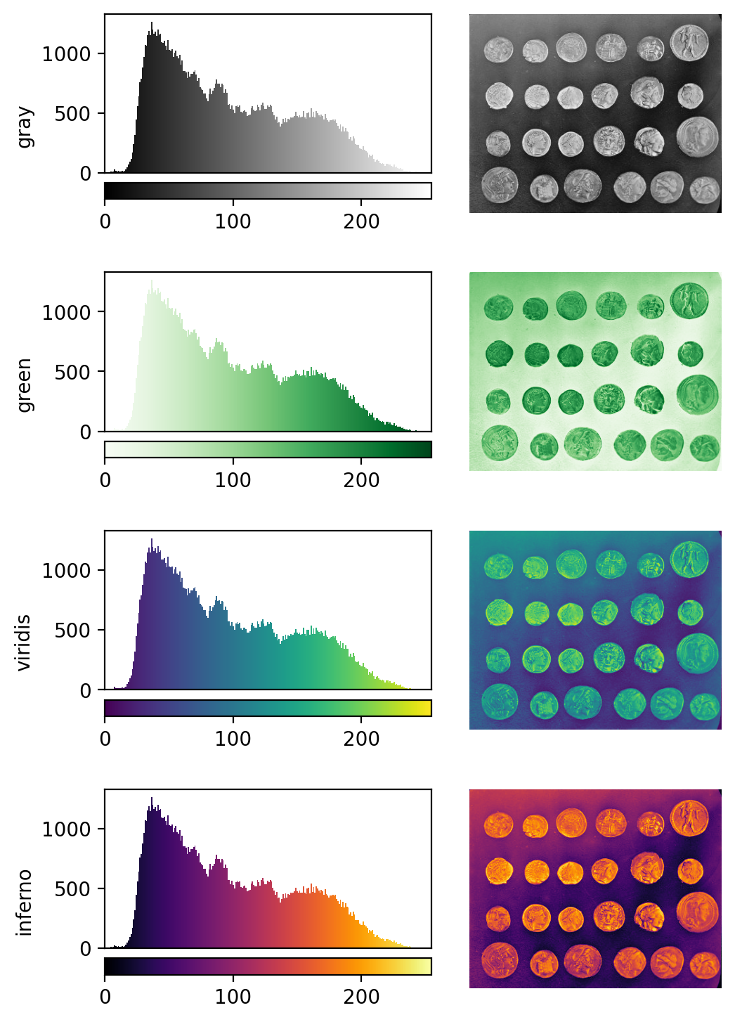
Figure 12
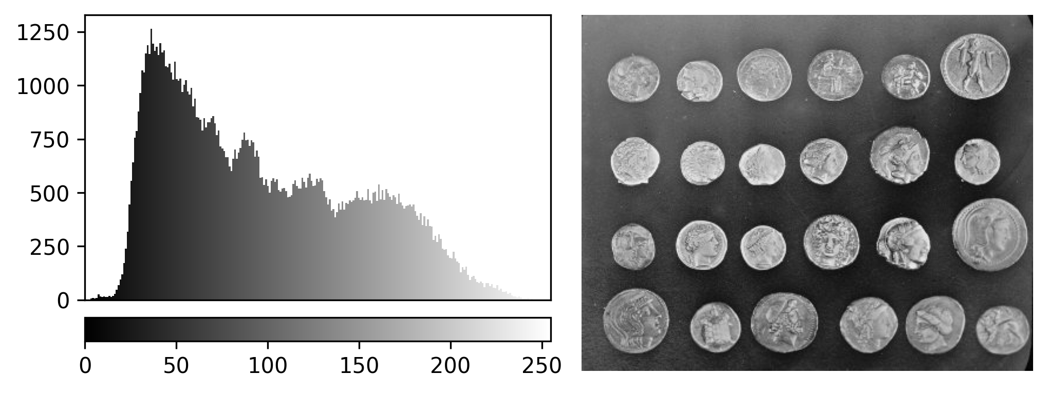
Figure 13
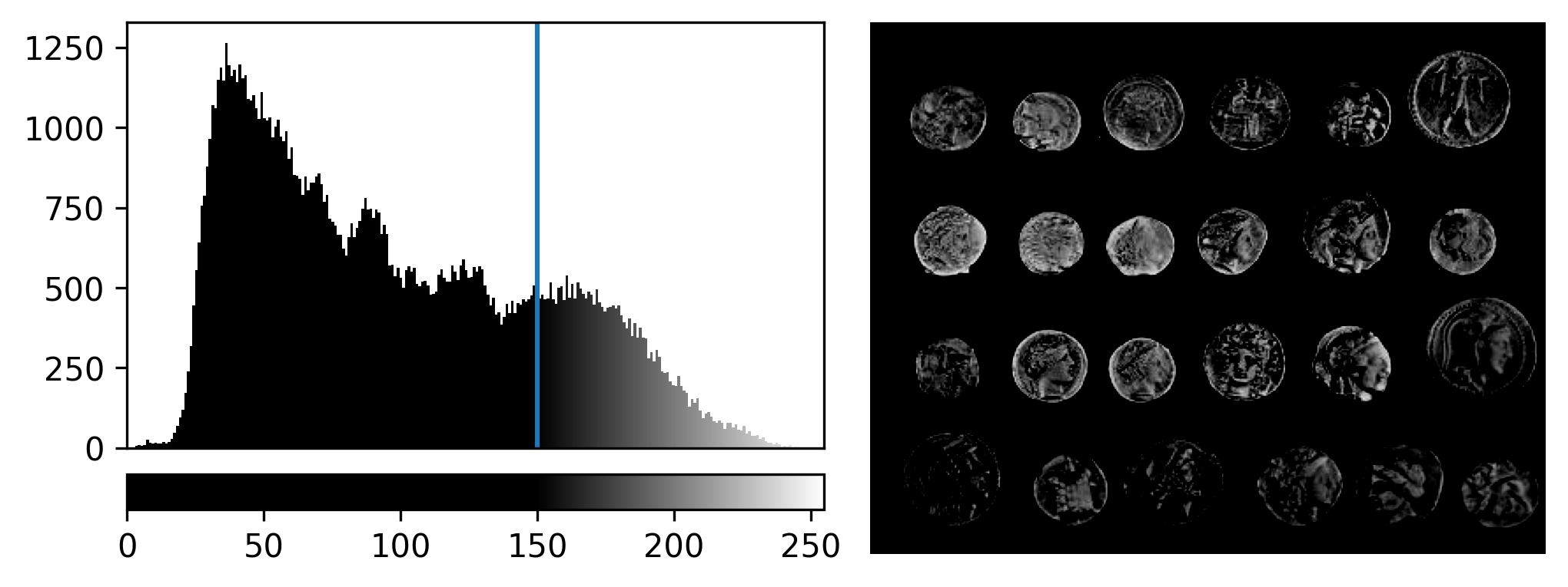
Figure 14
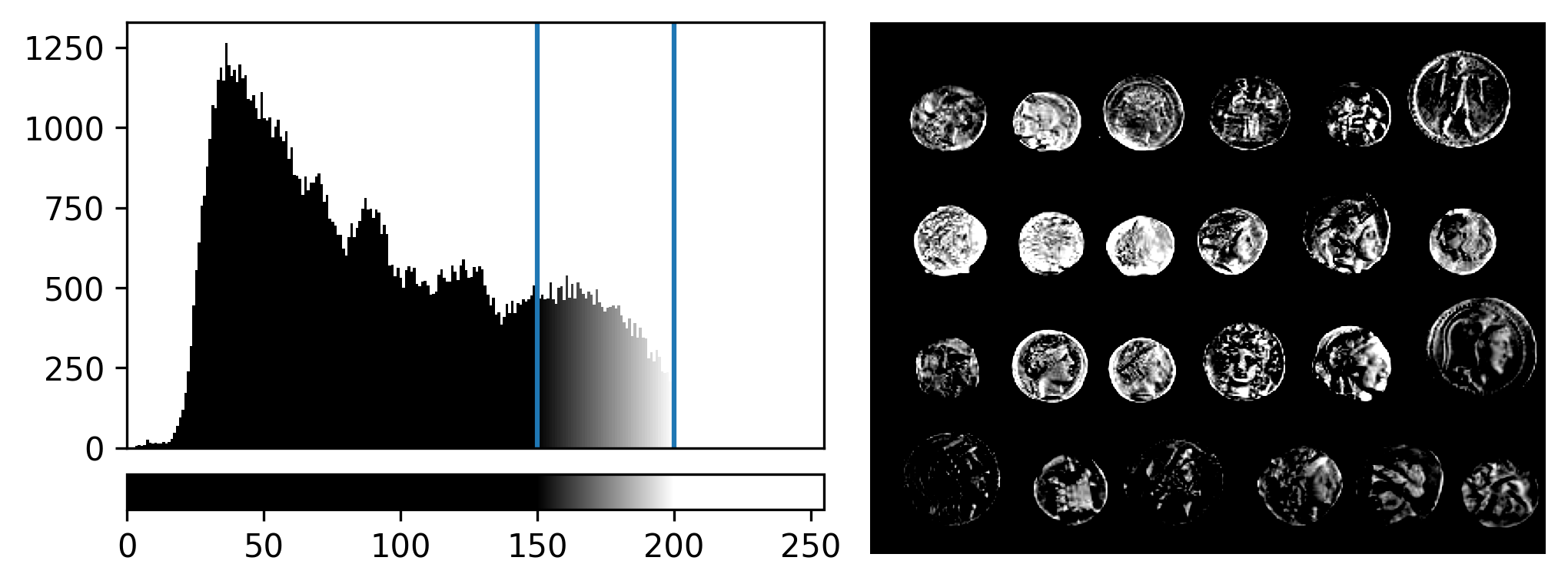
Figure 15
Open the Napari console with the button
and copy and paste the code below:
Multi-dimensional images
Figure 1
Figure 2
Figure 3
Let’s remove the mitosis image by clicking the remove layer button
at
the top right of the layer list. Then, let’s open a new 3D image:File > Open Sample > napari builtins > Brain (3D)
Figure 4
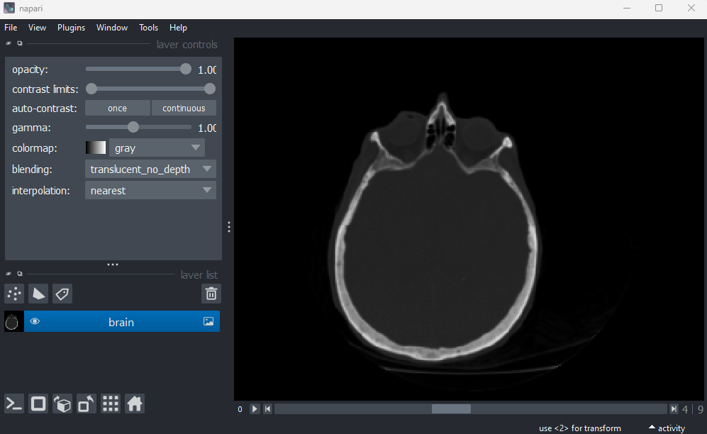
Figure 5
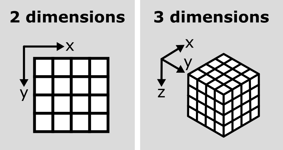
Figure 6
Figure 7
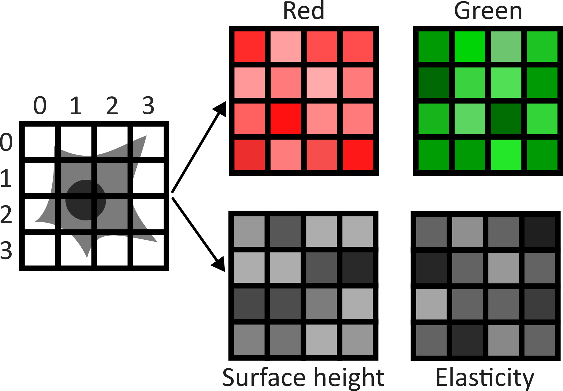
Figure 8
Figure 9
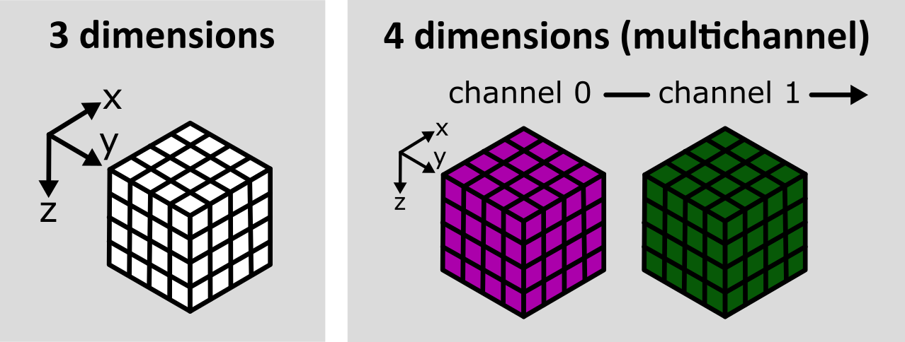
Figure 10
Channels can be easily shown/hidden with the  icons
icons
Figure 11
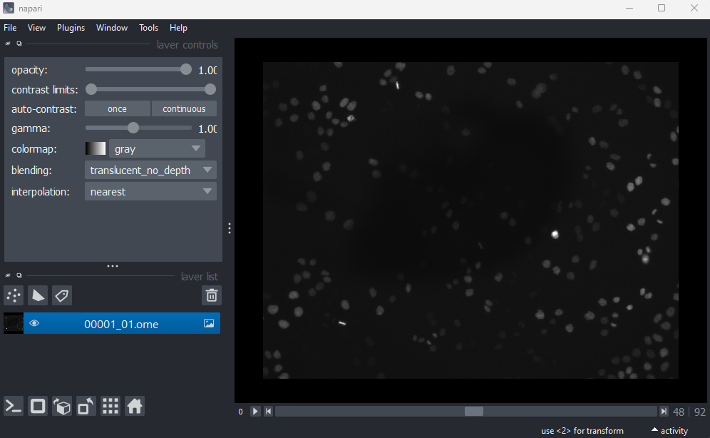
Figure 12
This image is a 2D time series (tyx) of some human cells undergoing
mitosis. The slider at the bottom now moves through time, rather than z
or channels. Try moving the slider from left to right - you should see
some nuclei divide and the total number of nuclei increase. You can also
press the small  icon at
the left side of the slider to automatically move along it. The icon
will change into a
icon at
the left side of the slider to automatically move along it. The icon
will change into a  - pressing
this will stop the movement.
- pressing
this will stop the movement.
Figure 13
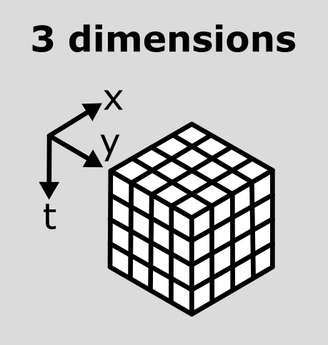
Figure 14
What do each of those dimensions represent? (e.g. t, c, z, y, x)
Hint: try using the roll dimensions button
to view different combinations of axes.
Figure 15
If we press the roll dimensions button
once, we can see an image of various cells and nuclei. Moving the slider
labelled ‘-4’ seems to move up and down in this image (i.e. the z axis),
while moving the slider labelled ‘-1’ changes between highlighting
different features like nuclei and cell edges (i.e. channels).
Therefore, the remaining two axes (-3 and -2) must be y and x. This
means the image’s 4 dimensions are (z, y, x, c)
Figure 16
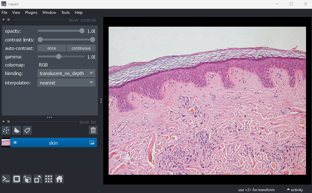
Figure 17
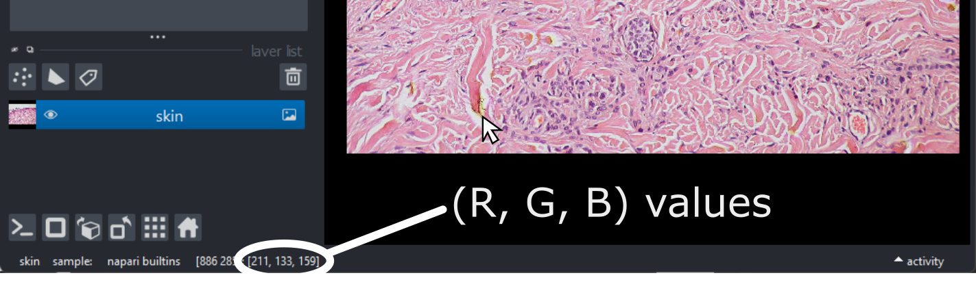
Figure 18
This shows the red, green and blue channels as separate image layers.
Try inspecting each one individually by clicking the icons to
hide the other layers.
Figure 19
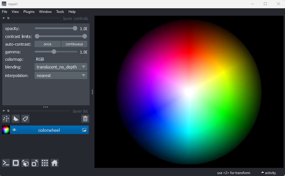
Figure 20
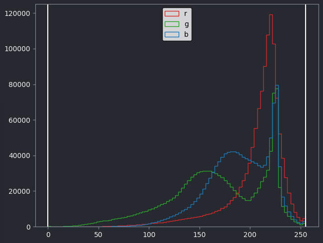
Figure 21
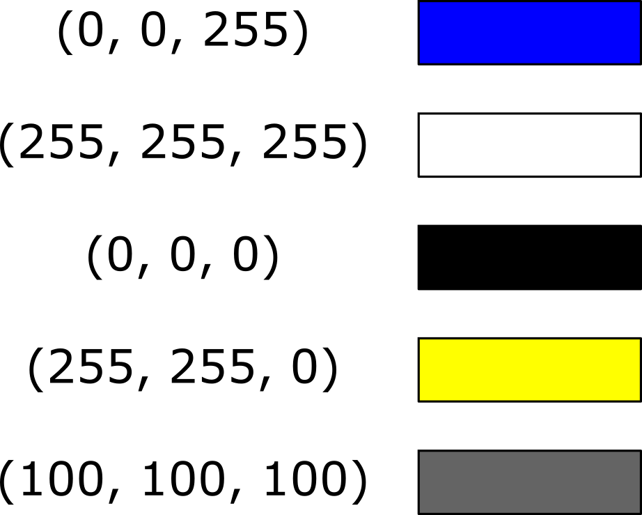
Filetypes and metadata
Figure 1
Figure 2
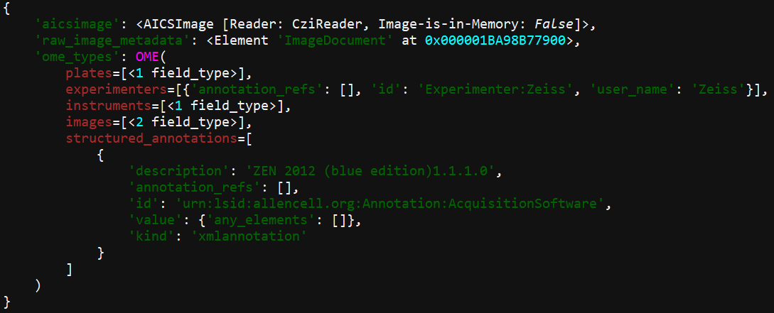
Figure 3
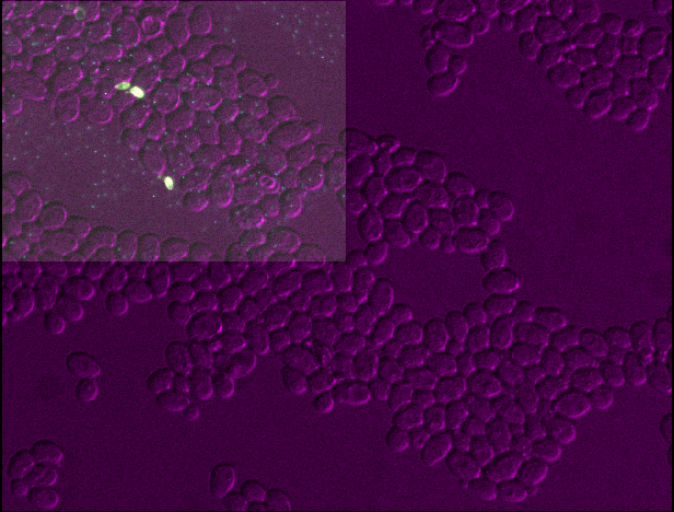
Figure 4
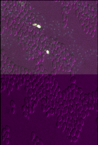
Figure 5
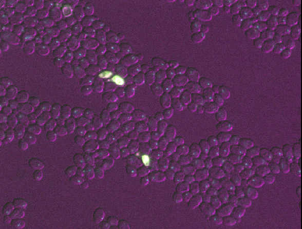
Figure 6

Figure 7
Open all four images in Napari. Zoom in very close to a bright
nucleus, and try showing / hiding different layers with the icon. How
do they differ? How does each compare to timepoint 30 of the original
‘00001_01.ome’ image?
Figure 8
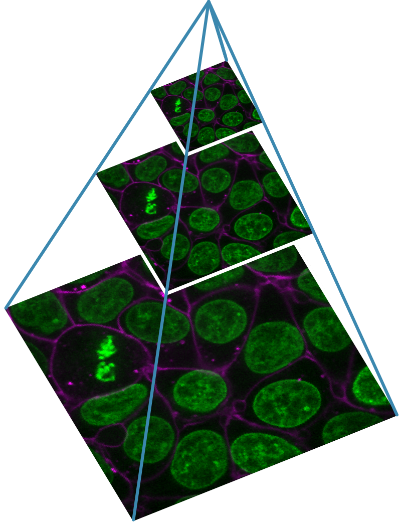
Designing a light microscopy experiment
Figure 1
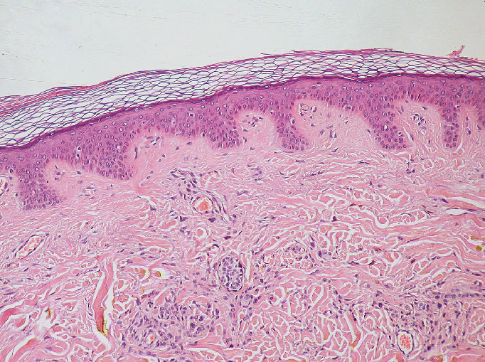
Figure 2
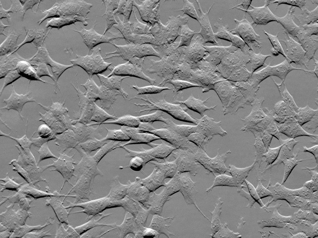
.jpg)
Figure 3
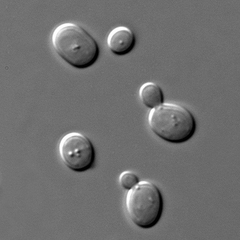

Figure 4
.jpg)
Figure 5
Choosing acquisition settings
Figure 1
Figure 2
Figure 3
Figure 4
Figure 5
Figure 6
Figure 7
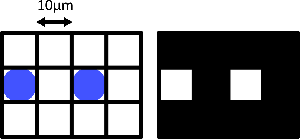
Figure 8
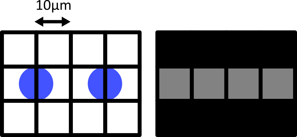
Figure 9
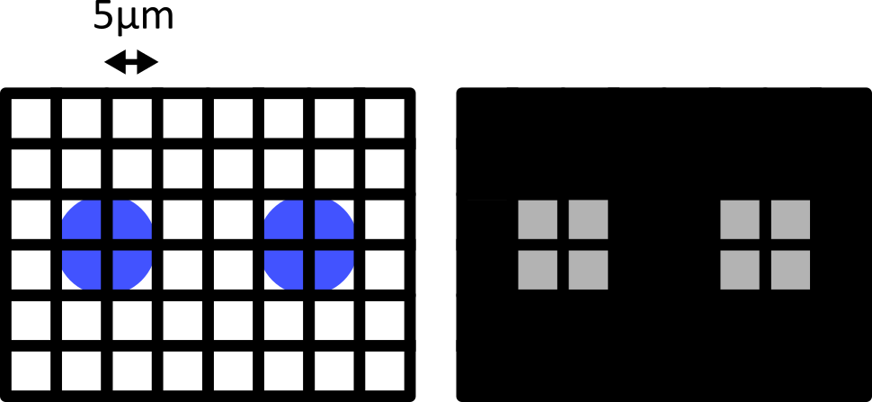
Figure 10
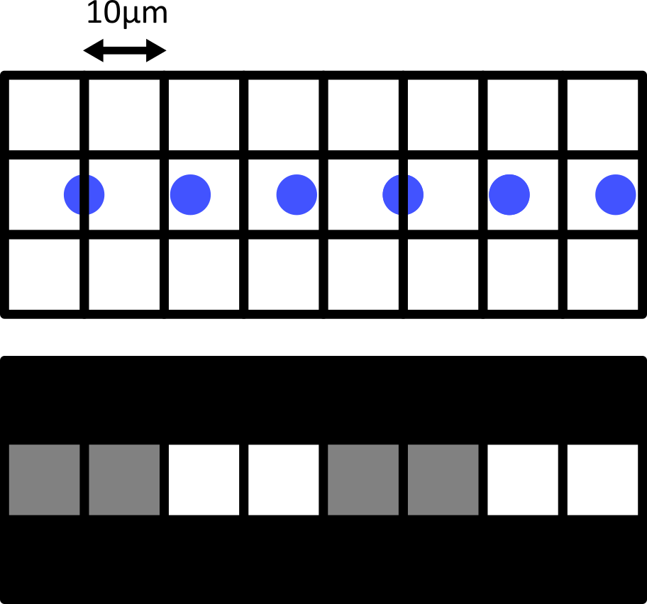
Figure 11
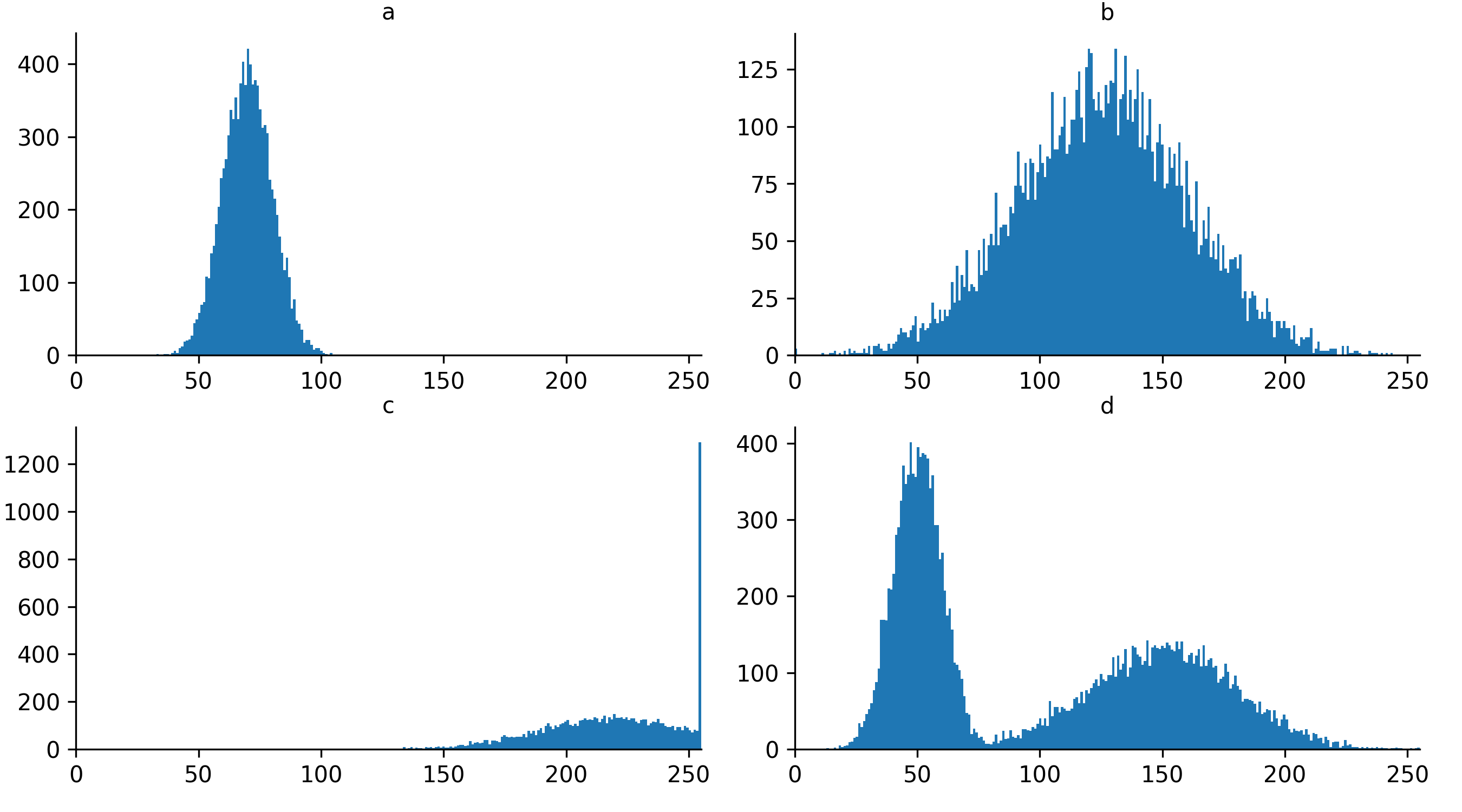
Quality control and manual segmentation
Figure 1
Figure 2
If you need a refresher on how to use napari matplotlib,
check out the image display
episode. It may also be useful to zoom into parts of the image
histogram by clicking the  icon at the top of histogram, then clicking and dragging a box around
the region you want to zoom into. You can reset your histogram by
clicking the
icon at the top of histogram, then clicking and dragging a box around
the region you want to zoom into. You can reset your histogram by
clicking the  icon.
icon.
Figure 3
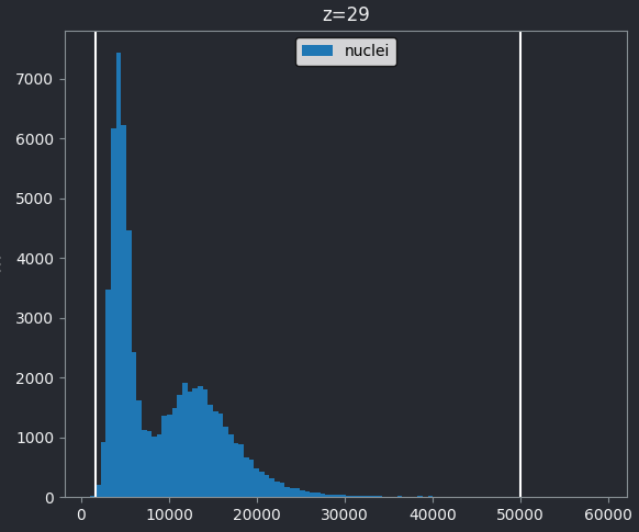
Figure 4
If we look at the brightest part of the image, near z=29, we can see
that there are indeed pixel values over much of this possible range. At
first glance, it may seem like there are no values at the right side of
the histogram, but if we zoom in using the
icon we can clearly see pixels at these higher values.
Figure 5
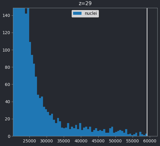
Figure 6
First, let’s take a quick look at a rough semantic segmentation. Open
Napari’s console by pressing the button,
then copy and paste the code below. Don’t worry about the details of
what’s happening in the code - we’ll look at some of these concepts like
gaussian blur and otsu thresholding in later episodes!
Figure 7
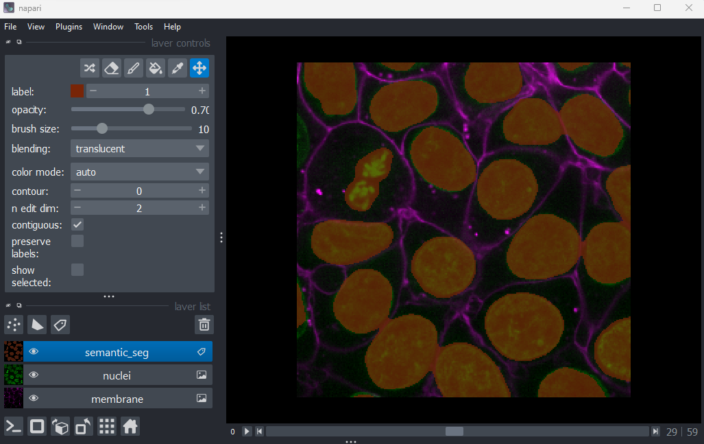
Figure 8
You should see an image appear that highlights the nuclei in brown.
Try toggling the ‘semantic_seg’ layer on and off multiple times, by
clicking the icon next
to its name in the layer list. You should see that the brown areas match
the nucleus boundaries reasonably well.
Figure 9
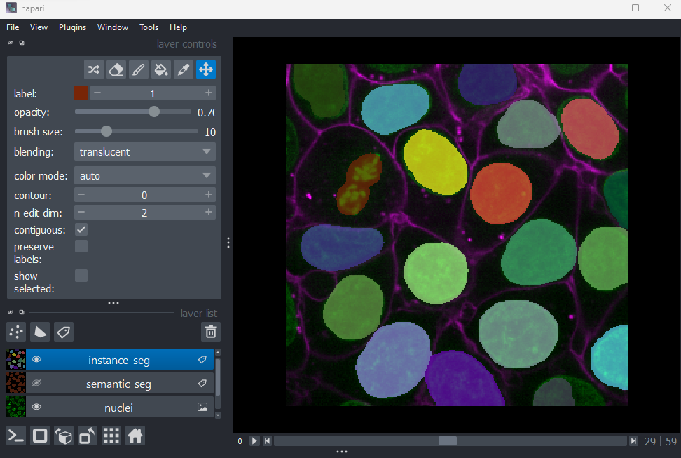
Figure 10
You should see an image appear that highlights nuclei in different
colours. Let’s hide the ‘semantic_seg’ layer by clicking the icon next
to its name in Napari’s layer list. Then try toggling the ‘instance_seg’
layer on and off multiple times, by clicking the corresponding icon. You
should see that the coloured areas match most of the nucleus boundaries
reasonably well, although there are some areas that are less well
labelled.
Figure 11
icon next
to ‘semantic_seg’ in the layer list to make it visible.Figure 12
icon next
to ‘instance_seg’ in the layer list to hide it.Figure 13
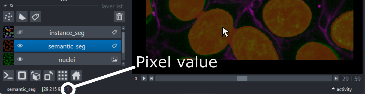
Figure 14
icon next
to ‘instance_seg’ in the layer list to make it visible.Figure 15
icon next
to ‘semantic_seg’ in the layer list to hide it.Figure 16
icon to remove these layers.Figure 17
Then click on the
icon (at the top of the layer list) to create a new Labels
layer.
Figure 18
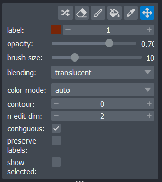
Figure 19
Let’s start by painting an individual nucleus. Select the paintbrush
by clicking the  icon
in the top row of the layer controls. Then click and drag across the
image to label pixels. You can change the size of the brush using the
‘brush size’ slider in the layer controls. To return to normal movement,
you can click the
icon
in the top row of the layer controls. Then click and drag across the
image to label pixels. You can change the size of the brush using the
‘brush size’ slider in the layer controls. To return to normal movement,
you can click the  icon
in the top row of the layer controls, or hold down spacebar to activate
it temporarily (this is useful if you want to pan slightly while
painting). To remove painted areas, you can activate the label eraser by
clicking the
icon
in the top row of the layer controls, or hold down spacebar to activate
it temporarily (this is useful if you want to pan slightly while
painting). To remove painted areas, you can activate the label eraser by
clicking the  icon.
icon.
Figure 20
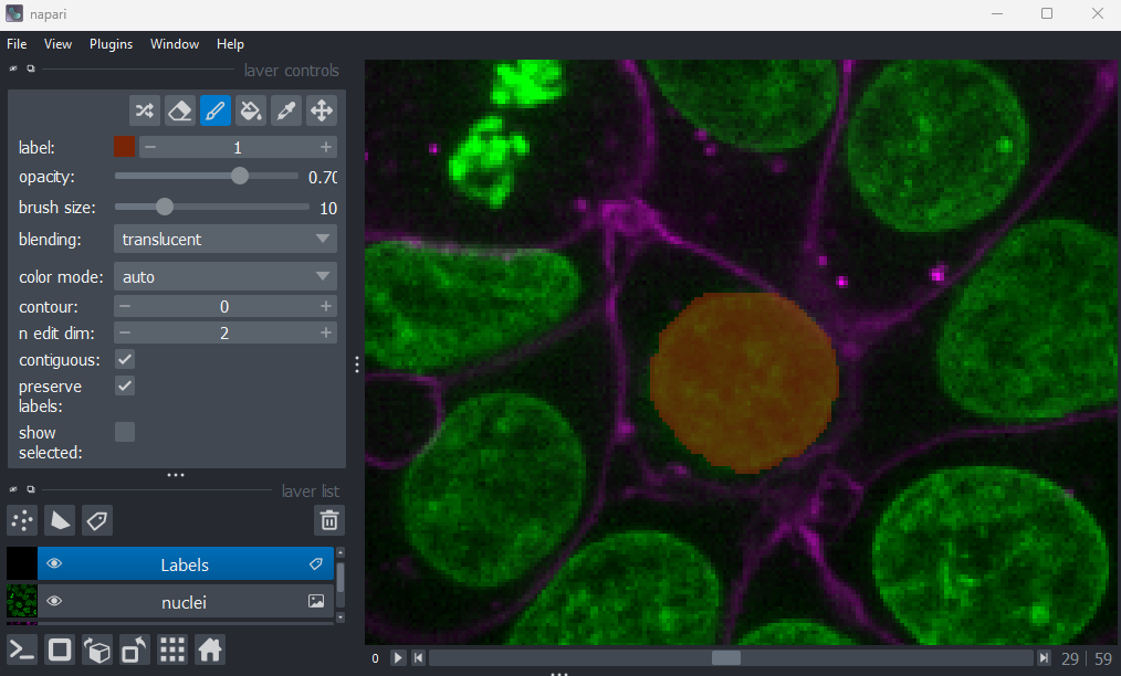
Figure 21
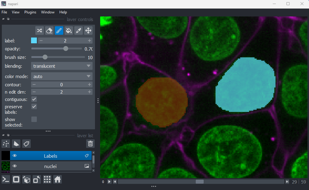
Figure 22
When you paint with a new value, you’ll see that Napari automatically
assigns it a new colour. This is because Labels layers use
a
special colormap/LUT for their pixel values. Recall from the image display episode that
colormaps are a way to convert pixel values into corresponding colours
for display. The colormap for Labels layers will assign
random colours to each pixel value, trying to ensure that nearby values
(like 2 vs 3) are given dissimilar colours. This helps to make it easier
to distinguish different labels. You can shuffle the colours used by
clicking the  icon in
the top row of the layer controls. Note that the pixel value of 0 will
always be shown as transparent - this is because it is usually used to
represent the background.
icon in
the top row of the layer controls. Note that the pixel value of 0 will
always be shown as transparent - this is because it is usually used to
represent the background.
Figure 23
 icon
do?
icon
do?Figure 24
 icon
do?
icon
do?Figure 25
icon
Figure 26
icon
Filters and thresholding
Figure 1
Make sure you only have ‘nuclei’ in the layer list. Select any
additional layers, then click the
icon to remove them. Also, select the nuclei layer (should be
highlighted in blue), and change its colormap from ‘green’ to ‘gray’ in
the layer controls.
Figure 2
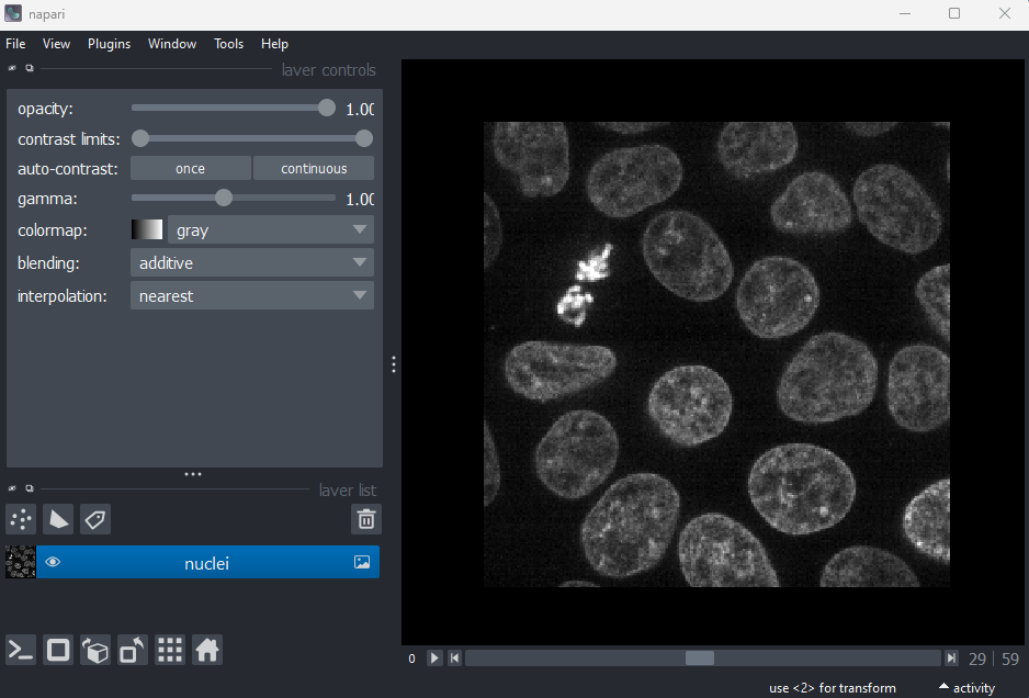
Figure 3
Figure 4
Figure 5
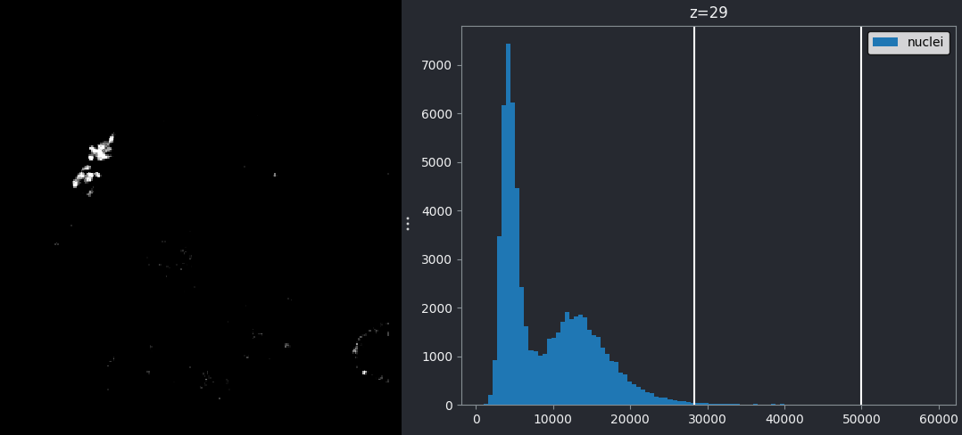
Figure 6
You should see a mask appear that highlights the nuclei in brown. If
we set the nuclei contrast limits back to normal (select ‘nuclei’ in the
layer list, then drag the left contrast limits node back to zero), then
toggle on/off the mask or nuclei layers with the icon, you
should see that the brown areas match the nucleus boundaries reasonably
well. They aren’t perfect though! The brown regions have a speckled
appearance where some regions inside nuclei aren’t labelled and some
areas in the background are incorrectly labelled.
Figure 7
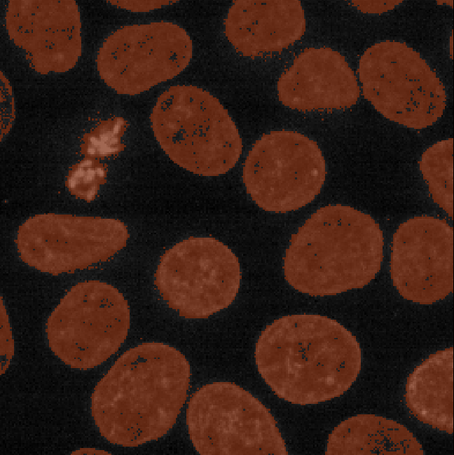
Figure 8
Figure 9
Figure 10
Figure 11
As before, make sure you only have ‘nuclei’ in the layer list. Select
any additional layers, then click the
icon to remove them. Also, select the nuclei layer (should be
highlighted in blue), and change its colormap from ‘green’ to ‘gray’ in
the layer controls.
Figure 12
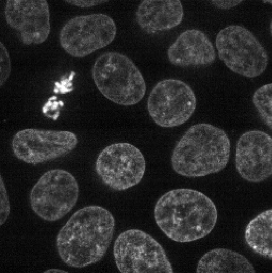
Figure 13
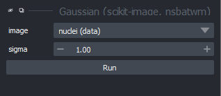
Figure 14
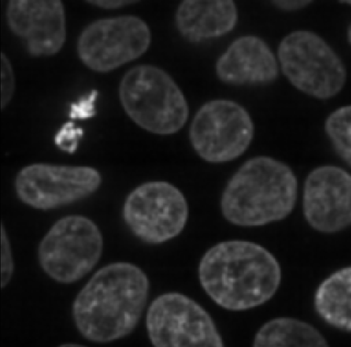
Figure 15
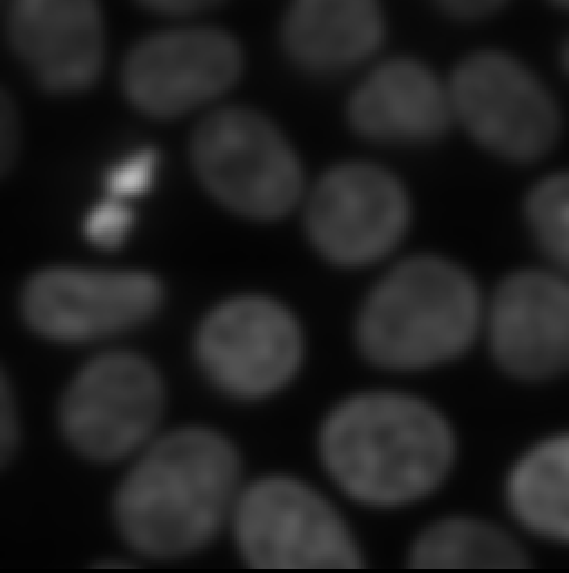
Figure 16
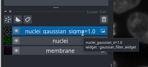
Figure 17
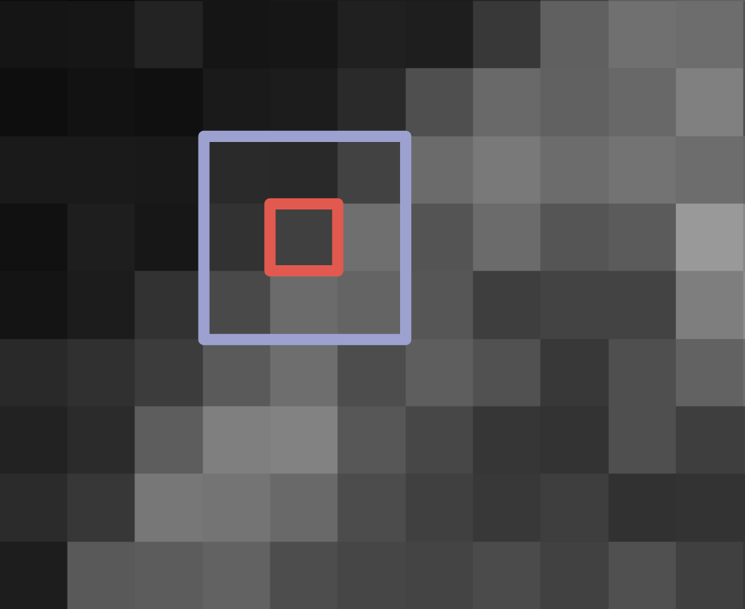
Figure 18
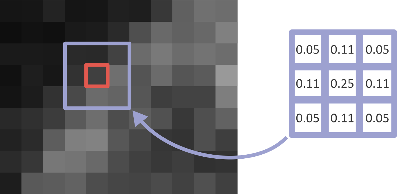
Figure 19
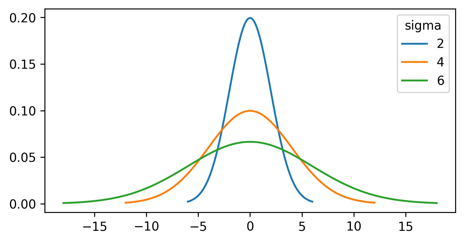
Figure 20
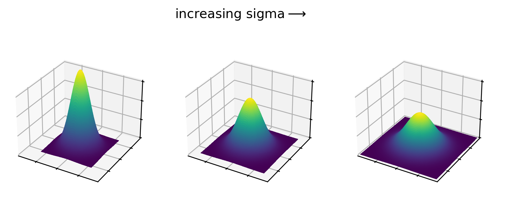
Figure 21
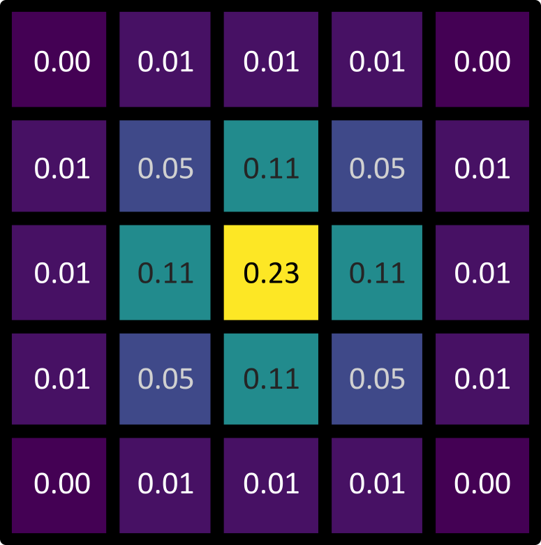
Figure 22
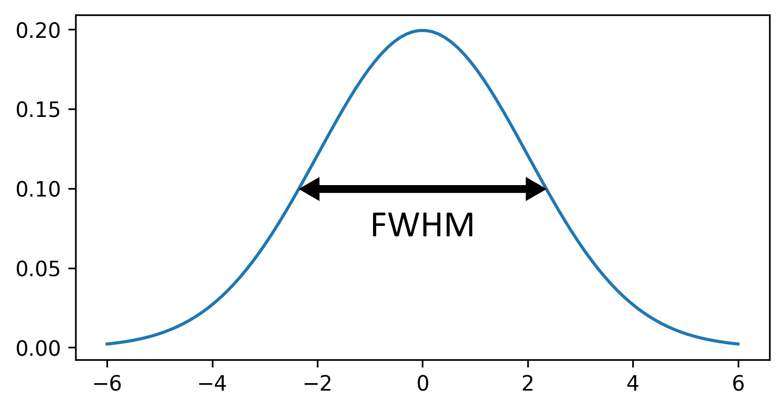
Figure 23
First, let’s clean up our layer list. Make sure you only have the
nuclei and nuclei_gaussian_sigma=3.0 layers in
the layer list - select any others and remove them by clicking the
icon. Close all filter settings panels on the right side of Napari
(apart from the gaussian settings) by clicking the tiny X
icon at their top left corner.
Figure 24
Let’s return to thresholding our image. Close the gaussian panel by
clicking the tiny X icon at its top left corner. Then
select the ‘blurred_mask’ in the layer list and remove it by clicking
the
icon. Finally, open the napari-matplotlib histogram again
with:Plugins > napari Matplotlib > Histogram
Figure 25
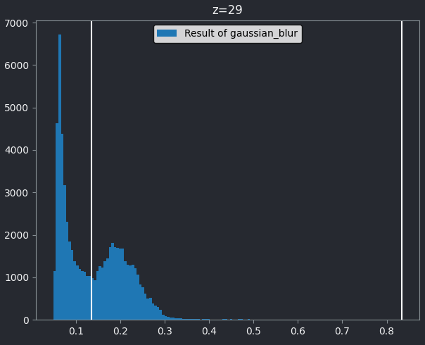
Figure 26
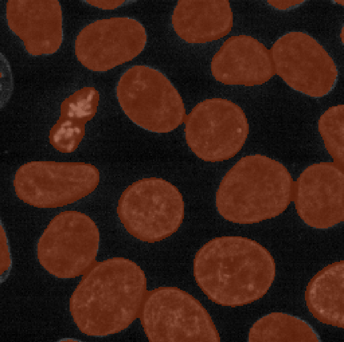
Figure 27
First, let’s clean up our layer list again. Make sure you only have
the ‘nuclei’, ‘mask’, ‘blurred_mask’ and ‘nuclei_gaussian_sigma=3.0’
layers in the layer list - select any others and remove them by clicking
the
icon. Then, if you still have the napari-matplotlib
histogram open, close it by clicking the tiny x icon in the
top left corner.
Figure 28
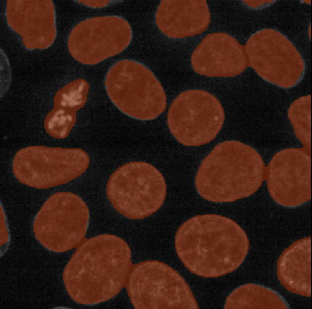
Figure 29
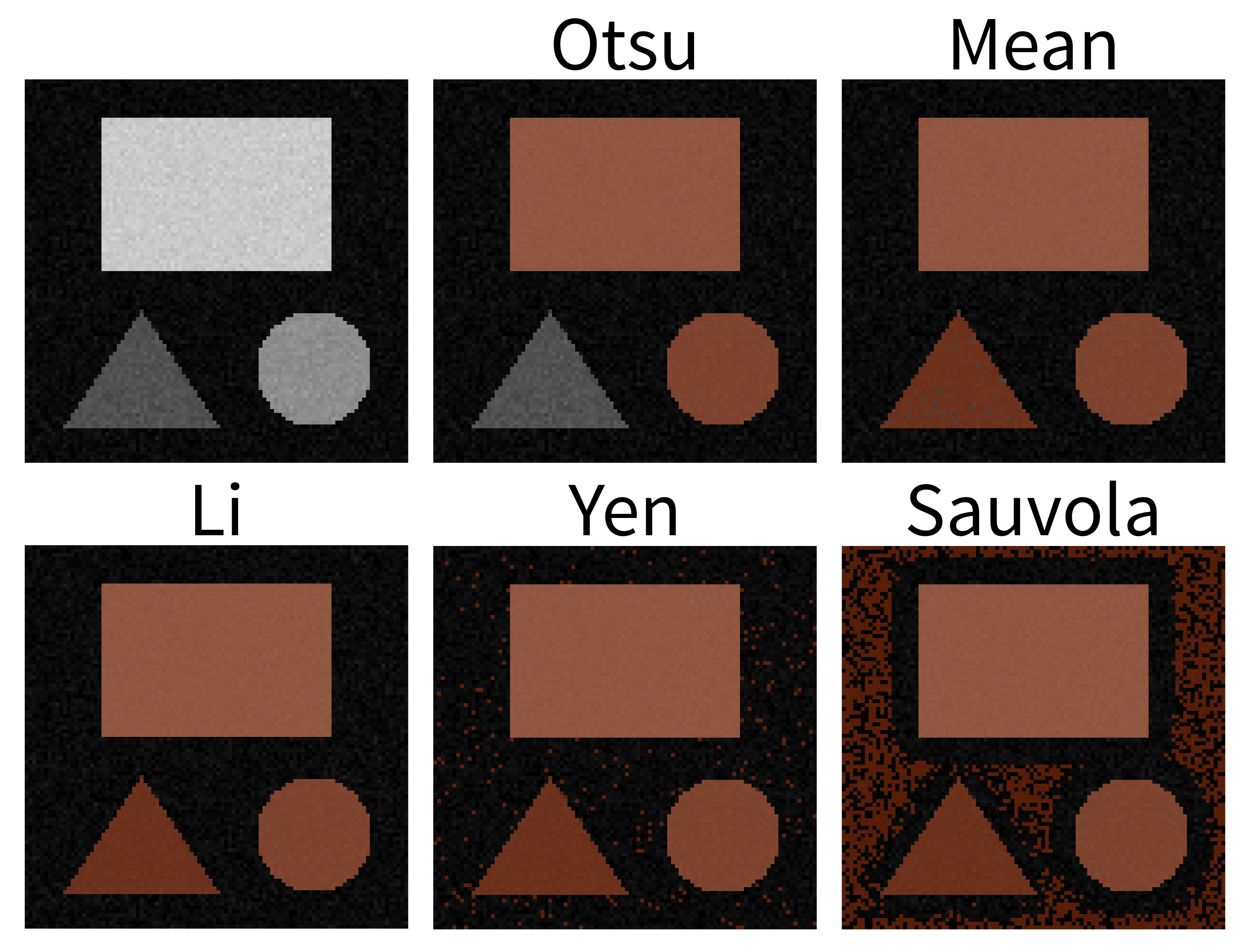
This should produce a mask (in a new layer ending with
‘threshold_otsu’) that is very similar to the one we created with a
manual threshold. To make it easier to compare, we can rename some of
our layers by double clicking on their name in the layer list - for
example, rename ‘mask’ to ‘manual_mask’, ‘blurred_mask’ to
‘manual_blurred_mask’, and ‘…threshold_otsu’ to ‘otsu_blurred_mask’.
Recall that you can change the colour of a mask by clicking the icon in
the top row of the layer controls. By toggling on/off the relevant icons, you
should see that Otsu chooses a slightly different threshold than we did
in our ‘manual_blurred_mask’, labelling slightly smaller regions as
nuclei in the final result.
Figure 30
Figure 31
Recall that you can change the colour of a mask by clicking the icon in
the top row of the layer controls.
Figure 32
Instance segmentation and measurements
Figure 1
Figure 2
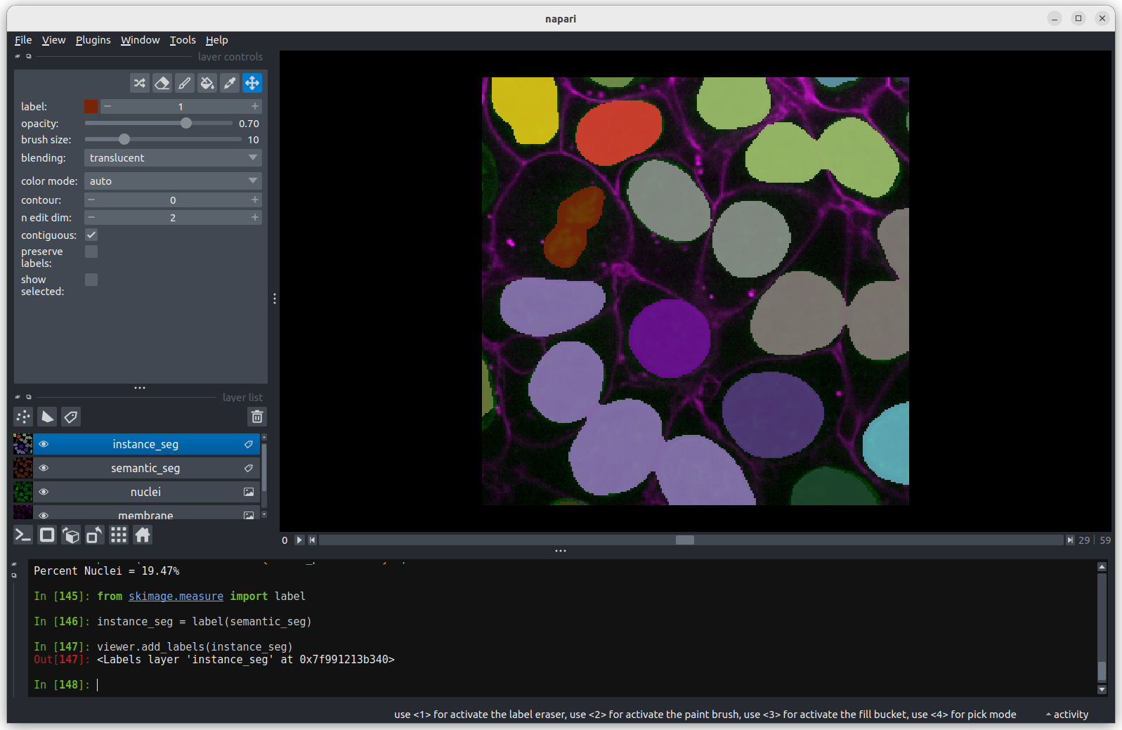
Figure 3
In the napari toolbar, open
Layers > Measure > Regionprops (labels) (skimage).
You should see a dialog like this: 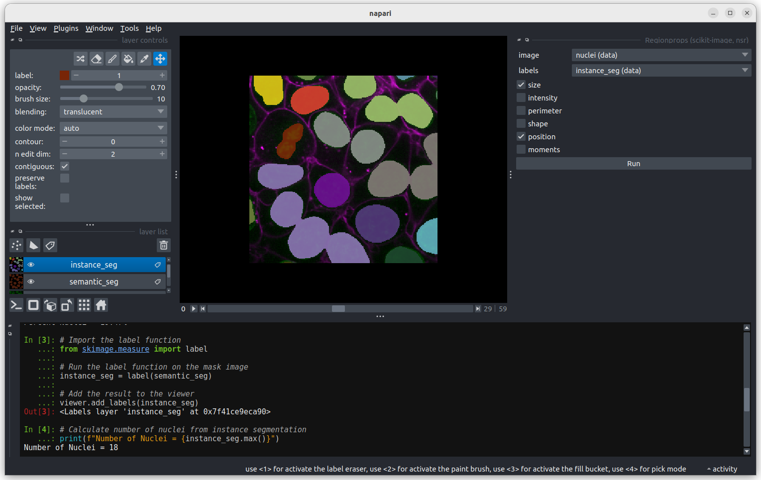
Figure 4
Click Analyze - a table of numeric values should appear
in napari. If it opens in an inconvenient location, you can click and
drag on the header containing the x,  and other icons
next to the table window to reposition it.
and other icons
next to the table window to reposition it. 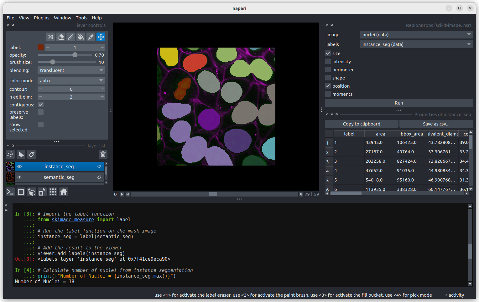
Figure 5
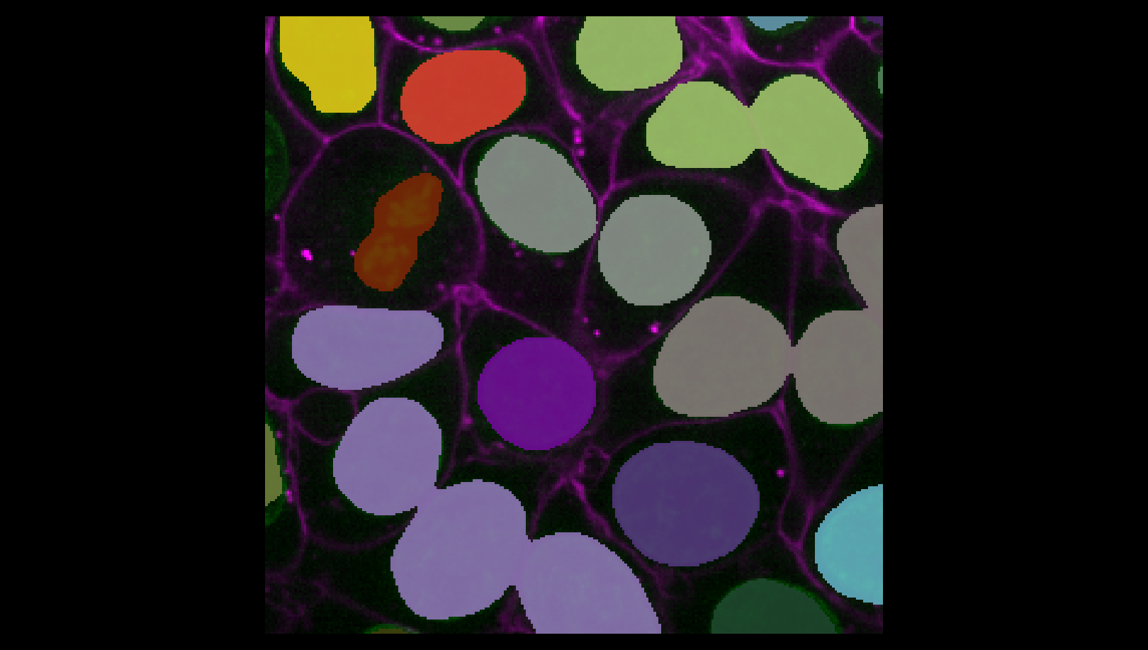
Figure 6
You may remember from our first
lesson that we can change to 3D view mode by pressing the button. Try it now.
Figure 7
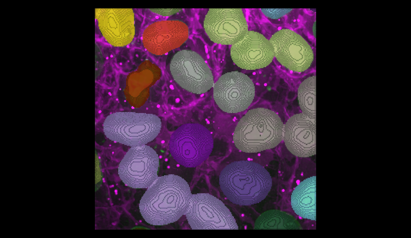 You should see the image rendered in 3D, with a clear join between the
upper most light purple nucleus and its neighbour.
You should see the image rendered in 3D, with a clear join between the
upper most light purple nucleus and its neighbour.
Figure 8
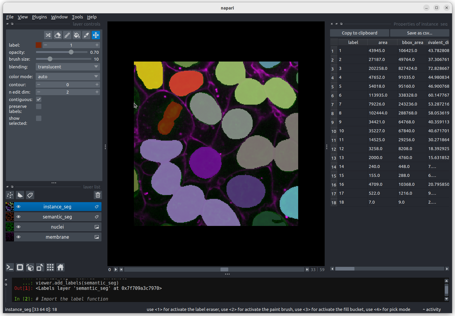
Figure 9
Some nuclei that are touching remain partially
connected. 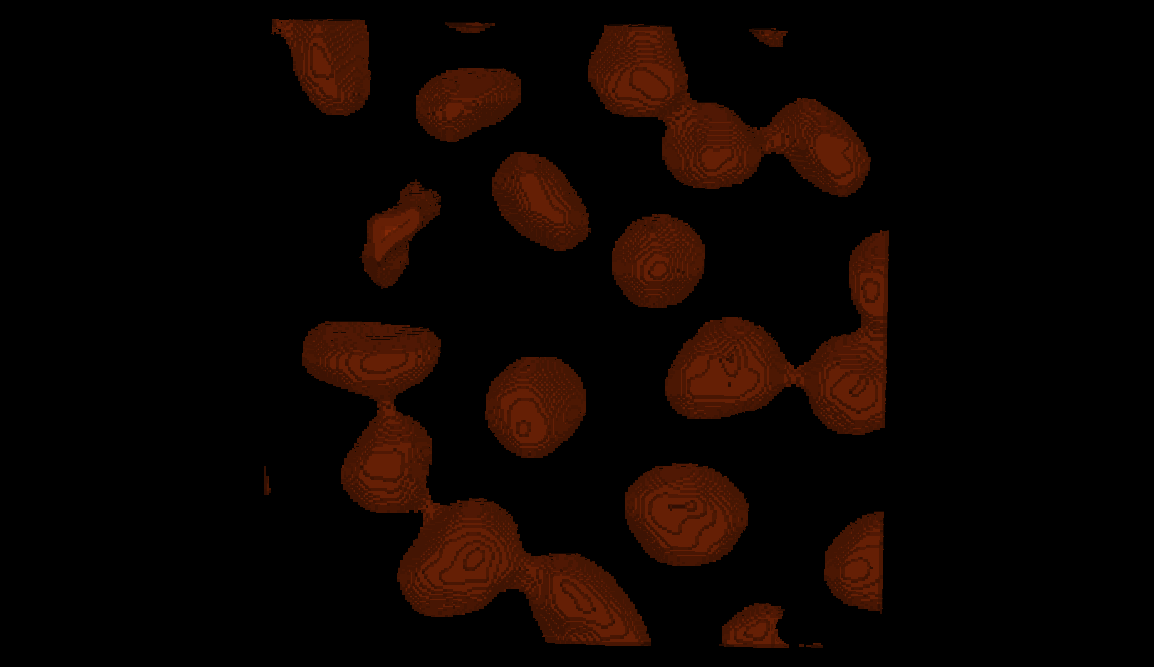
Figure 10
Erosion with a radius of 10 removes enough pixels to separate
touching nuclei
while still keeping the nuclei you want to analyse. 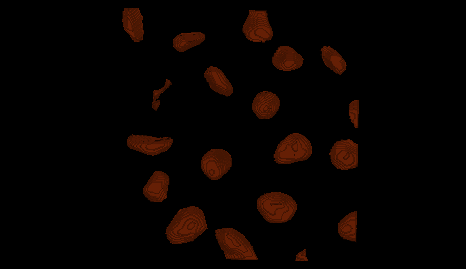
Figure 11
Erosion with a radius of 15 is too strong: several nuclei become
over‑eroded
and some disappear completely. 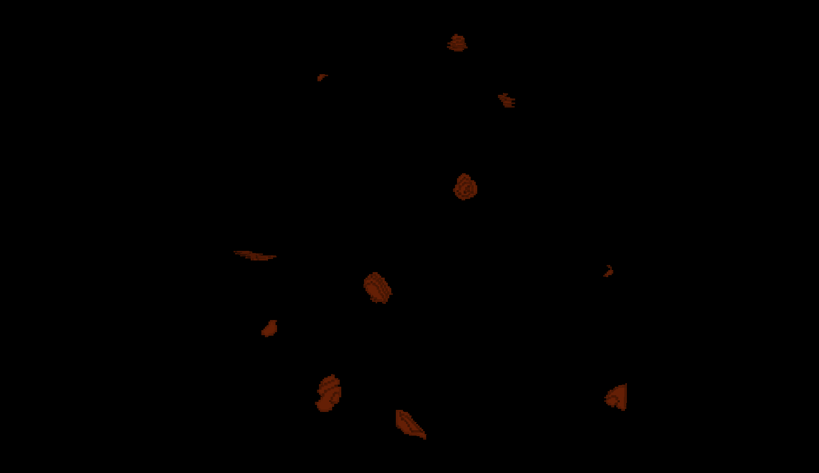
Figure 12
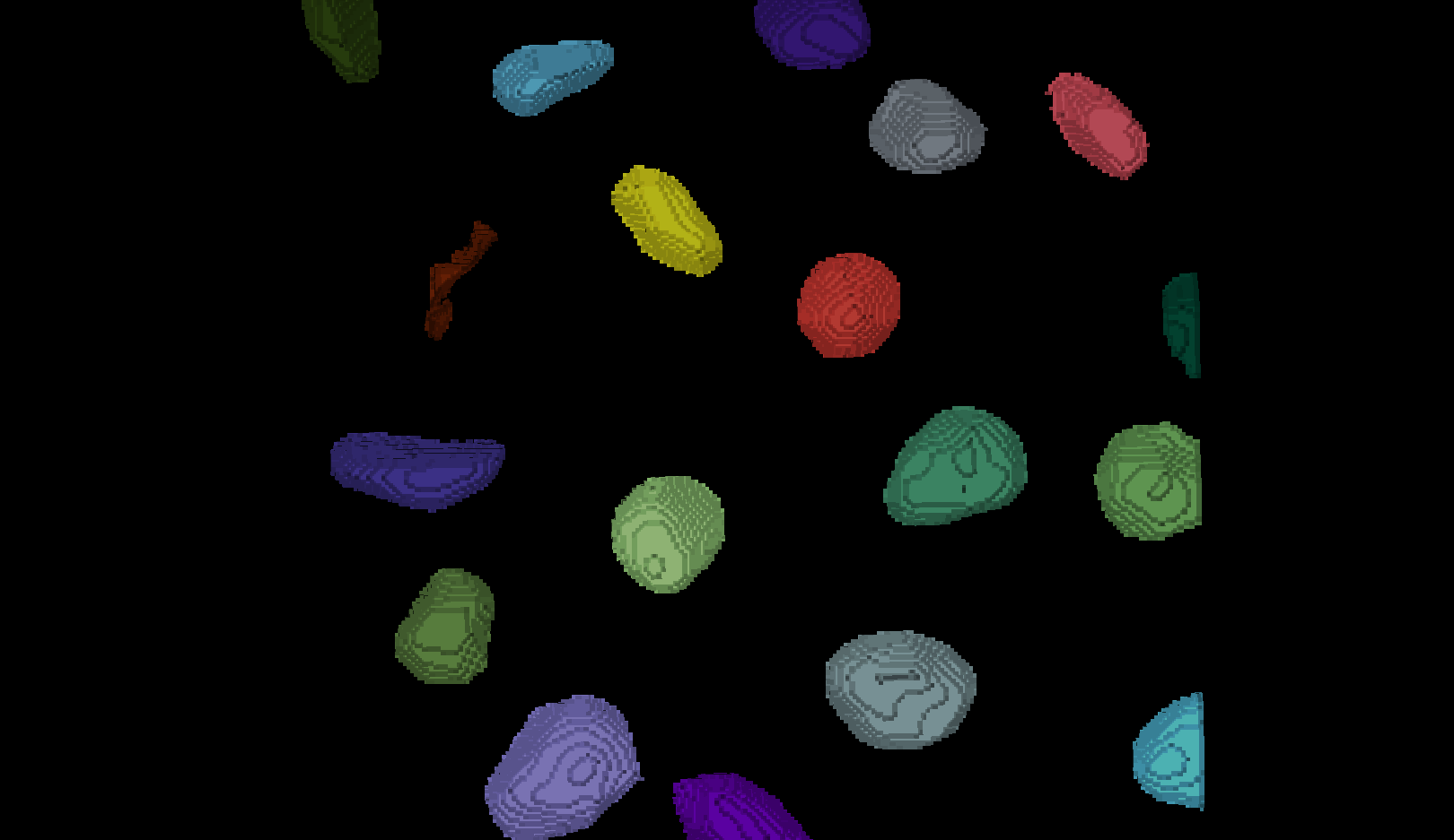
Figure 13
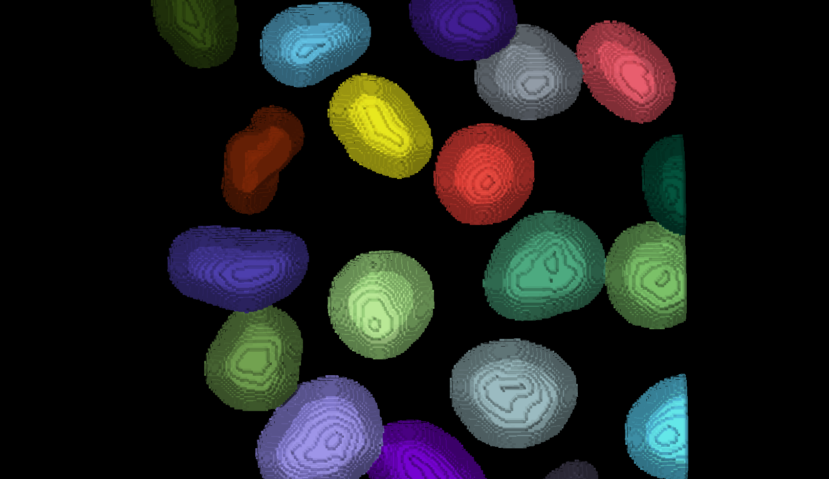 There are now 19 apparently correctly labelled nuclei that appear to be
the same shape as in the original mask image.
There are now 19 apparently correctly labelled nuclei that appear to be
the same shape as in the original mask image.
Figure 14
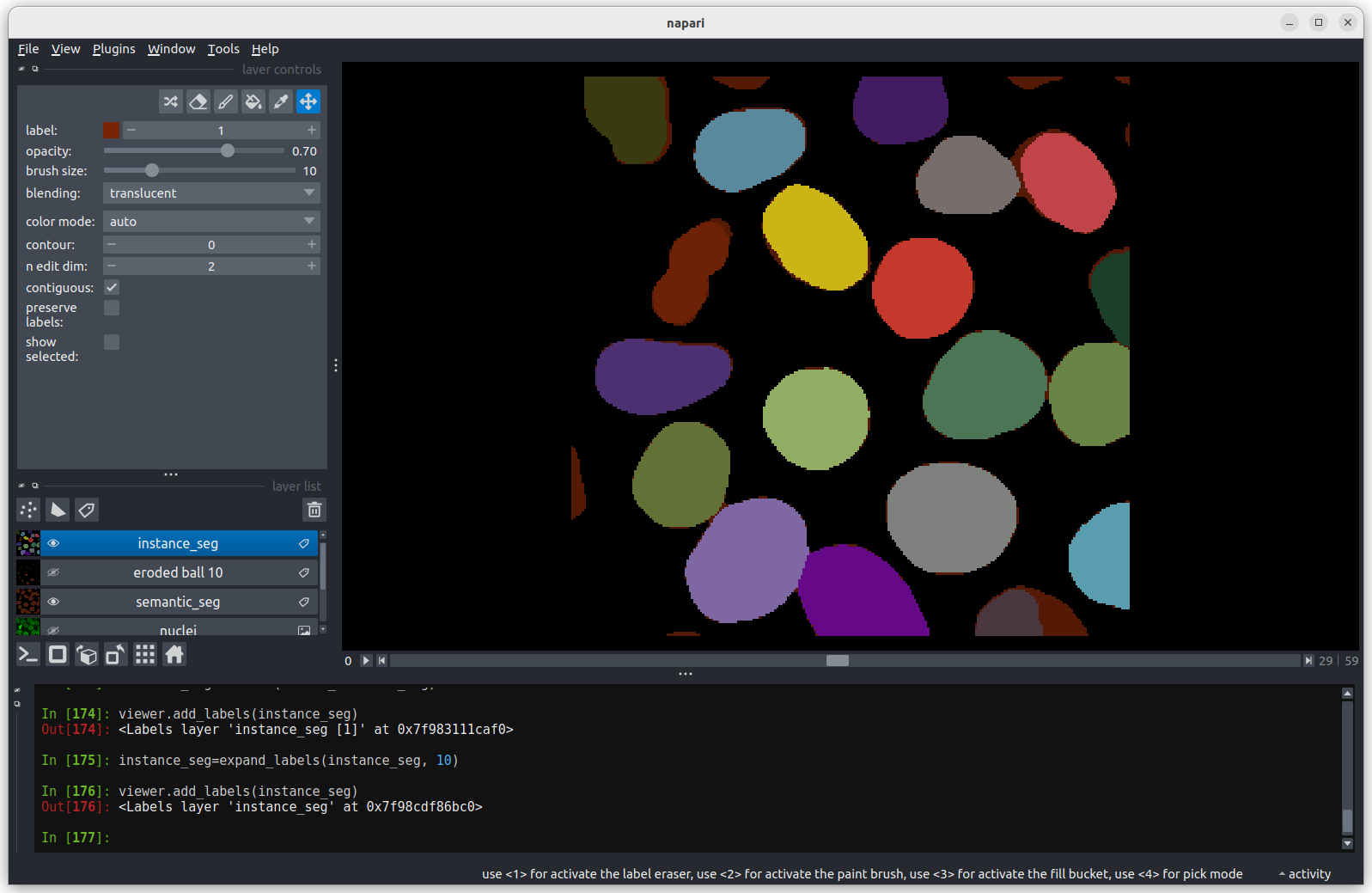 Looking at the above image we can see some small mismatches around the
edges of most of the nuclei. It should be remembered when looking at
this image that it is a single slice though a 3D image, so in some cases
where the differences look large (for example the nucleus at the bottom
right) they may still be only one pixel deep. Will the effect of this on
the accuracy of our results be significant?
Looking at the above image we can see some small mismatches around the
edges of most of the nuclei. It should be remembered when looking at
this image that it is a single slice though a 3D image, so in some cases
where the differences look large (for example the nucleus at the bottom
right) they may still be only one pixel deep. Will the effect of this on
the accuracy of our results be significant?
Figure 15