Image display
Last updated on 2025-11-04 | Edit this page
Overview
Questions
- How are pixel values converted into colours for display?
Objectives
- Create a histogram for an image
- Install plugins from Napari Hub
- Change colormap (LUT) in Napari
- Adjust brightness and contrast in Napari
- Explain the importance of always retaining a copy of the original pixel values
Image array and display
Last episode we saw that images are arrays of numbers with specific dimensions and data type. Napari reads these numbers (pixel values) and converts them into colours on our display, allowing us to view the image. Exactly how this conversion is done can vary greatly, and is the topic of this episode.
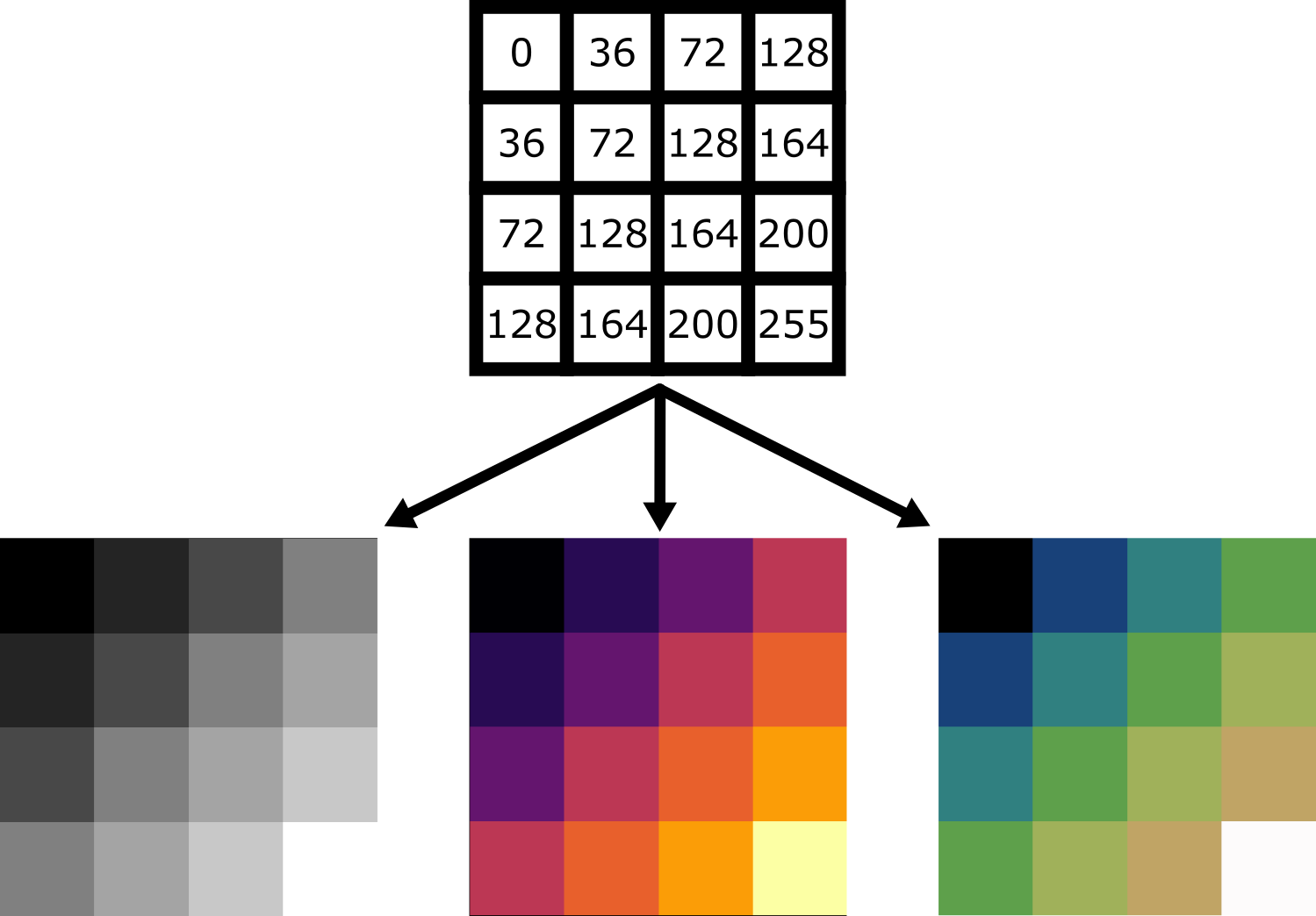
For example, take the image array shown below. Depending on the display settings, it can look very different inside Napari:
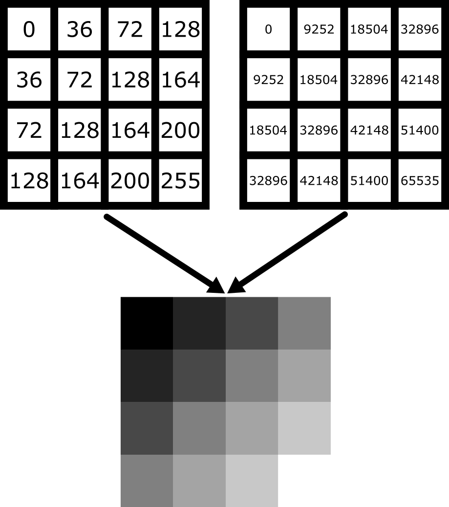
Equally, image arrays with different pixel values can look the same in Napari depending on the display settings:
In summary, we can’t rely on appearance alone to understand the underlying pixel values. Display settings (like the colormap, brightness and contrast - as we will see below) have a big impact on how the final image looks.
Napari plugins
How can we quickly assess the pixel values in an image? We could hover over pixels in Napari, or print the array into Napari’s console (as we saw last episode), but these are hard to interpret at a glance. A much better option is to use an image histogram.
To do this, we will have to install a new plugin for Napari. Remember from the Imaging Software episode that plugins add new features to a piece of software. Napari has hundreds of plugins available on the napari hub website.
Let’s start by going to the napari hub and searching for ‘matplotlib’:
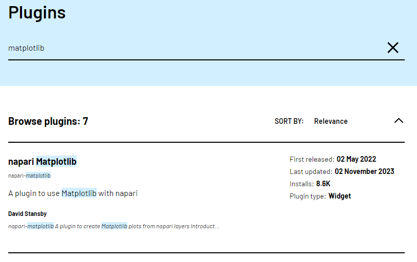
You should see ‘napari Matplotlib’ appear in the list (if not, try
scrolling further down the page). If we click on
napari matplotlib this opens a summary of the plugin with
links to the documentation and github repository containing the plugin’s
source code.
Now that we’ve found the plugin we want to use, let’s go ahead and
install it in Napari. Note that some plugins have special requirements
for installation, so it’s always worth checking their napari hub page
for any extra instructions. In the top menu bar of Napari select:Plugins > Install/Uninstall Plugins...
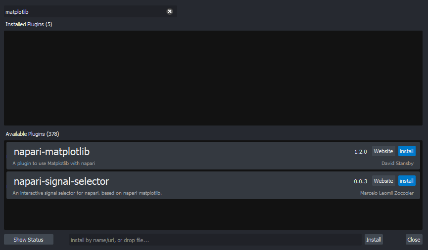
This should open a window summarising all installed plugins (at the top) and all available plugins to install (at the bottom). If we search for ‘matplotlib’ in the top searchbar, then ‘napari-matplotlib’ will appear under ‘Available Plugins’. Press the blue install button and wait for it to finish. You’ll then need to close and re-open Napari.
If all worked as planned, you should see a new option in the top
menubar under:Plugins > napari Matplotlib
Finding plugins
Napari hub contains hundreds of plugins with varying quality, written by many different developers. It can be difficult to choose which plugins to use!
- Search for cell tracking plugins on Napari hub
- Look at some of the plugin summaries, documentation and github repositories
- What factors could help you decide if the plugin is well maintained?
- What factors could help you decide if the plugin is popular with Napari users?
Is a plugin well maintained?
Some factors to look for:
Last updated
Check when the plugin was last updated - was it recently? This is shown
in the search list summary and in the left sidebar when you open the
plugin’s page on napari-hub.
Documentation
Is the plugin summary (+ any linked documentation) detailed enough to
explain how to use the plugin?
Is a plugin popular?
Some factors to look for:
Stars on github
If you open a plugin’s linked github repository, you can see the number
of ‘stars’ in the top right. More stars tend to indicate a plugin is
more popular - although this isn’t always the case! Github is mainly
used by plugin developers, so a plugin with few stars may still have
many people using it.
Image.sc
It can also be useful to search the plugin’s name on the image.sc forum to browse relevant
posts and see if other people had good experiences using it. Image.sc is
also a great place to get help and advice from other plugin users, or
the plugin’s developers.
Image histograms
Let’s use our newly installed plugin to look at the human mitosis
image. If you don’t have it open, go the top menubar and select:File > Open Sample > napari builtins > Human Mitosis
Then open the image histogram with:Plugins > napari Matplotlib > Histogram
You should see a histogram open on the right side of the image:
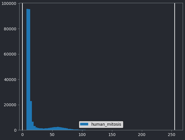
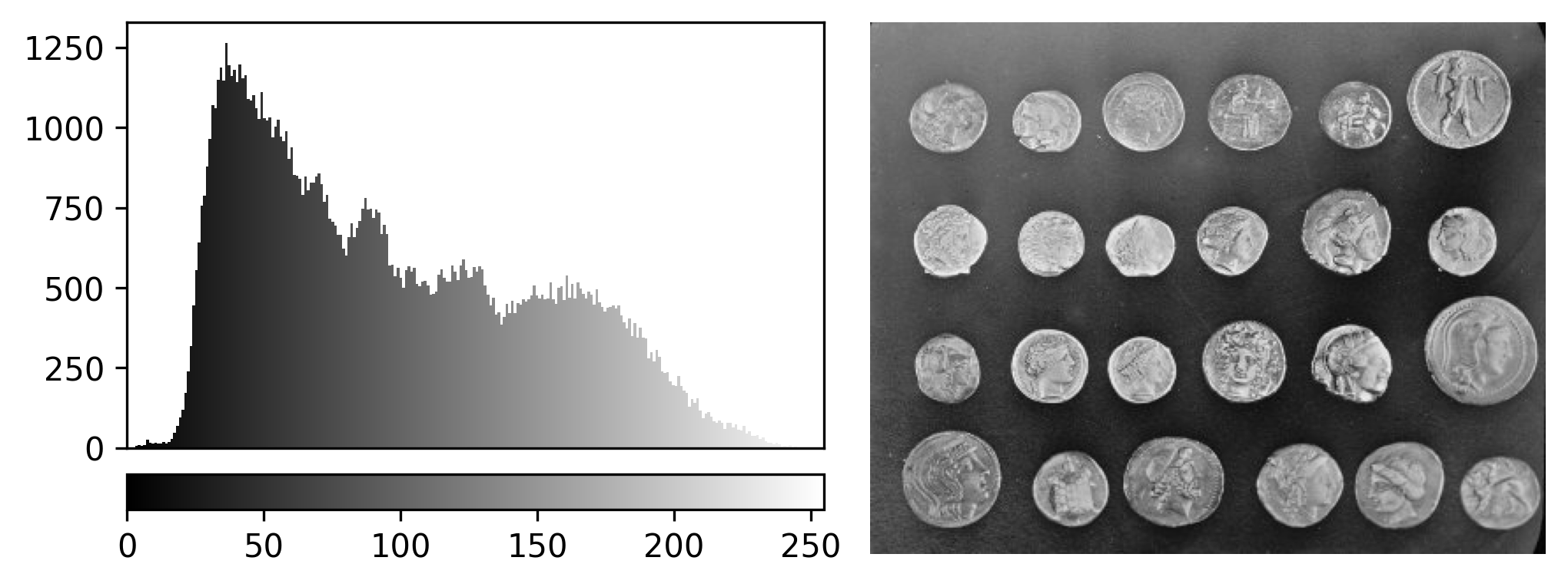
This histogram summarises the pixel values of the entire image. On the x axis is the pixel value which run from 0-255 for this 8-bit image. This is split into a number of ‘bins’ of a certain width (for example, it could be 0-10, 11-20 and so on…). Each bin has a blue bar whose height represents the number of pixels with values in that bin. So, for example, for our mitosis image we see the highest bars to the left, with shorter bars to the right. This means this image has a lot of very dark (low intensity) pixels and fewer bright (high intensity) pixels.
The vertical white lines at 0 and 255 represent the current ‘contrast limits’ - we’ll look at this in detail in a later section of this episode.
Let’s quickly compare to another image. Open the ‘coins’ image
with:File > Open Sample > napari builtins > Coins
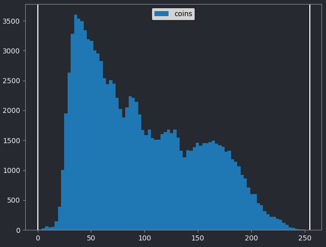
From the histogram, we can see that this image has a wider spread of pixel values. There are bars of similar height across many different values (rather than just one big peak at the left hand side).
Image histograms are a great way to quickly summarise and compare pixel values of different images.
Histograms
Match each of these small test images to their corresponding histogram. You can assume that all images are displayed with a standard gray colormap and default contrast limits of the min/max possible pixel values:
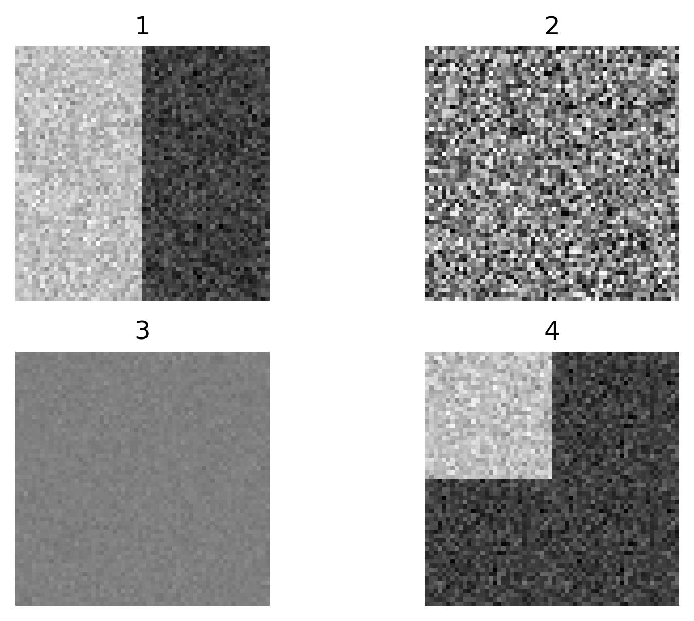
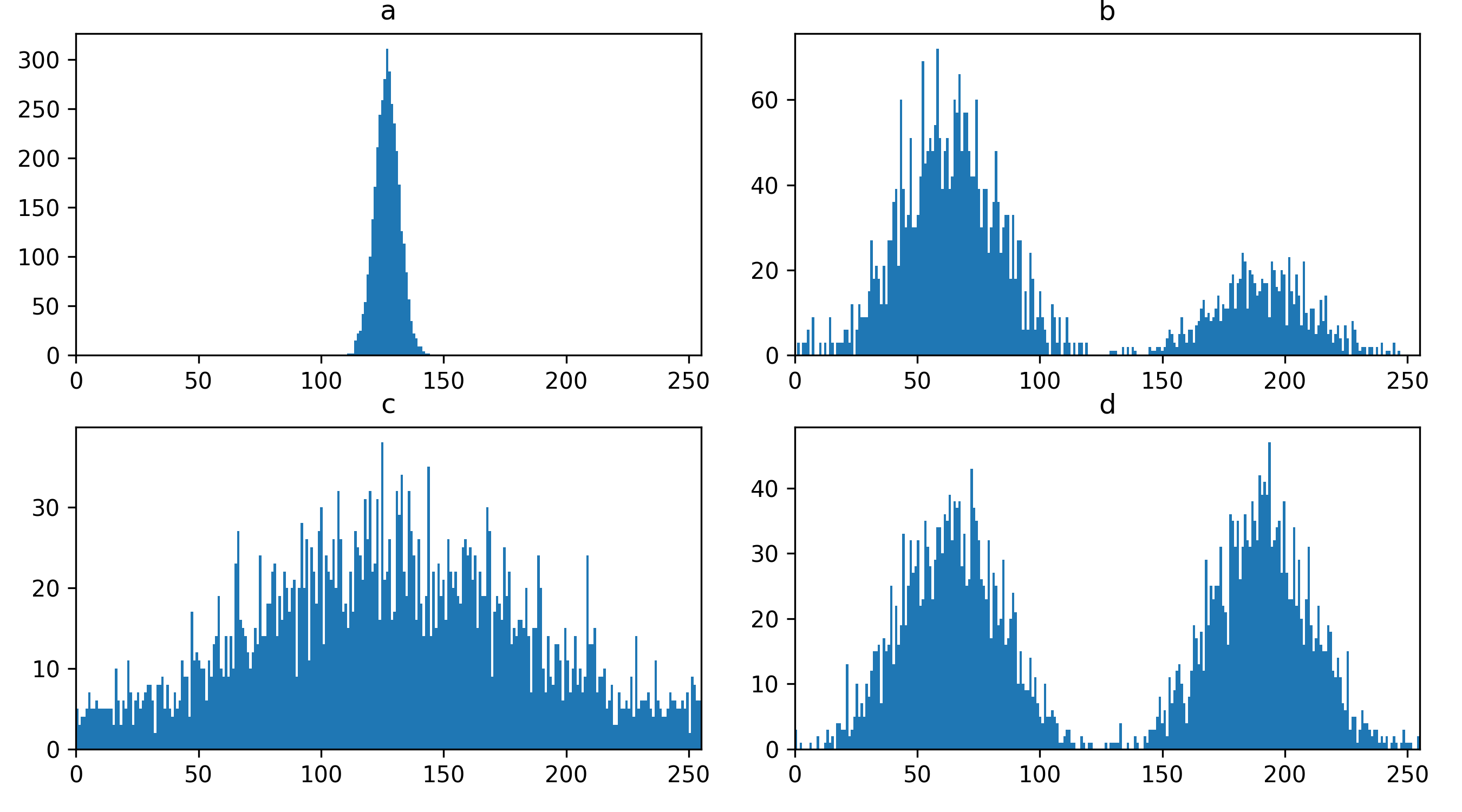
- a - 3
- b - 4
- c - 2
- d - 1
Changing display settings
What happens to pixel values when we change the display settings? Try changing the contrast limits or colormap in the layer controls. You should see that the blue bars of the histogram stay the same, no matter what settings you change i.e. the display settings don’t affect the underlying pixel values.
This is one of the reasons it’s important to use software designed for scientific analysis to work with your light microscopy images. Software like Napari and ImageJ will try to ensure that your pixel values remain unchanged, while other image editing software (designed for working with photographs) may change the pixel values in unexpected ways. Also, even with scientific software, some image processing steps (that we’ll see in later episodes) will change the pixel values.
Keep this in mind and make sure you always retain a copy of your original data, in its original file format! We’ll see in the ‘Filetypes and metadata’ episode that original image files contain important metadata that should be kept for future reference.
Colormaps / LUTs
Let’s dig deeper into Napari’s colormaps. As we saw in the ‘What is an image?’ episode, images are represented by arrays of numbers (pixel values) with certain dimensions and data type. Napari (or any other image viewer) has to convert these numbers into coloured squares on our screen to allow us to view and interpret the image. Colormaps (also known as lookup tables or LUTs) are a way to convert pixel values into corresponding colours for display. For example, remember the image at the beginning of this episode, showing an image array using three different colormaps:
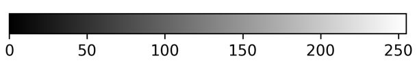
Napari supports a wide range of colormaps that can be selected from the ‘colormap’ menu in the layer controls (as we saw in the Imaging Software episode). For example, see the diagram below showing the ‘gray’ colormap, where every pixel value from 0-255 is matched to a shade of gray:
See the diagram below for examples of 4 different colormaps applied to the ‘coins’ image from Napari, along with corresponding image histograms:
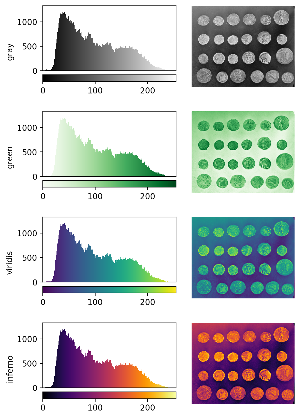
Why would we want to use different colormaps?
- to highlight specific features in an image
- to help with overlaying multiple images, as we saw in the Imaging Software episode when we displayed green nuclei and magenta membranes together.
- to help interpretation of an image. For example, if we used a red fluorescent label in an experiment, then using a red colormap might help people understand the image quickly.
Brightness and contrast
As the final section of this episode, let’s learn more about the ‘contrast limits’ in Napari. As we saw in the Imaging Software episode, adjusting the contrast limits in the layer controls changes how bright different parts of the image are displayed. What is really going on here though?
In fact, the ‘contrast limits’ are adjusting how our colormap gets applied to the image. For example, consider the standard gray colormap:
For an 8-bit image, the range of colours from black to white are normally spread from 0 (the minimum pixel value) to 255 (the maximum pixel value). If we move the left contrast limits node, we change where the colormap starts from e.g. for a value of 150 we get:
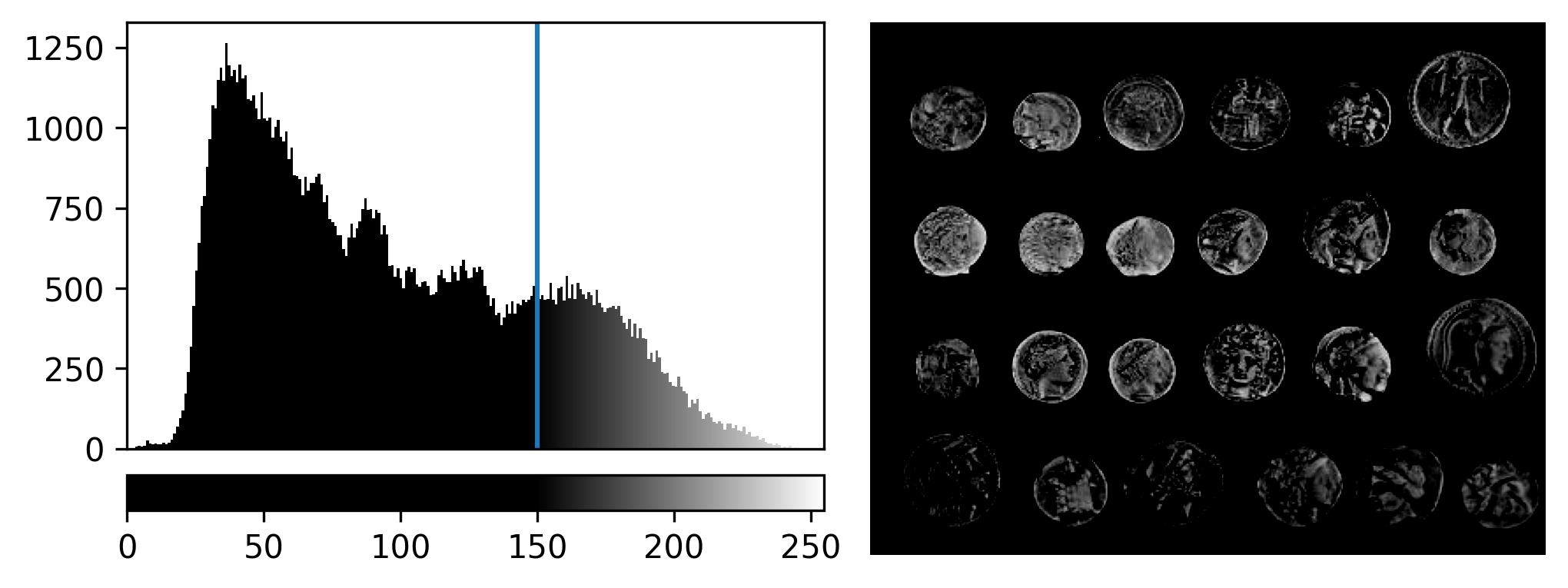
Now all the colours from black to white are spread over a smaller
range of pixel values from 150-255 and everything below 150 is set to
black. Note that in Napari you can set specific values for the contrast
limits by right clicking on the contrast limits slider. As you adjust
the contrast limits, the vertical white lines on the
napari-matplotlib histogram will move to match.
If we move the right contrast limits node, we change where the colormap ends (i.e. where pixels are fully white). For example, for contrast limits of 150 and 200:
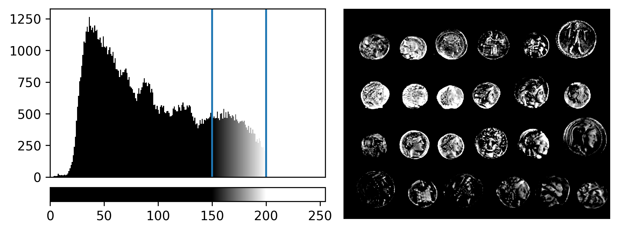
Now the range of colours from black to white only cover the pixel values from 150-200, everything below is black and everything above is white.
Why do we need to adjust contrast limits?
to allow us to see low contrast features. Some parts of your image may only differ slightly in their pixel value (low contrast). Bringing the contrast limits closer together allows a small change in pixel value to be represented by a bigger change in colour from the colormap.
to focus on specific features. For example, increasing the lower contrast limit will remove any low intensity parts of the image from the display.
Adjusting contrast
Open the Napari console with the ![]() button
and copy and paste the code below:
button
and copy and paste the code below:
import numpy as np
from skimage.draw import disk
image = np.full((100,100), 10, dtype="uint8")
image[:, 50:100] = 245
image[disk((50, 25),15)] = 11
image[disk((50, 75),15)] = 247
viewer.add_image(image)
This 2D image contains two hidden circles:
- Adjust Napari’s contrast limits to view both
- What contrast limits allow you to see each circle? (remember you can right click on the contrast limit bar to see specific values). Why do these limits work?
The left circle can be seen with limits of e.g. 0 and 33
These limits work because the background on the left side of the image has a pixel value of 10 and the circle has a value of 11. By moving the upper contrast limit to the left we force the colormap to go from black to white over a smaller range of pixel values. This allows this small difference in pixel value to be represented by a larger difference in colour and therefore made visible.
The right circle can be seen with limits of e.g. 231 and 255. This works for a very similar reason - the background has a pixel value of 245 and the circle has a value of 247.
- The same image array can be displayed in many different ways in Napari
- Image histograms provide a useful overview of the pixel values in an image
- Plugins can be searched for on Napari hub and installed via Napari
- Colormaps (or LUTs) map pixel values to colours
- Contrast limits change the range of pixel values the colormap is spread over