Filters and thresholding
Last updated on 2026-06-08 | Edit this page
Overview
Questions
- How can thresholding be used to create masks?
- What are filters and how do they work?
Objectives
Threshold an image manually using its histogram, and display the result in Napari
Use some Napari plugins to perform two commonly used image processing steps: gaussian blurring and otsu thresholding
Explain how filters work - e.g. what is a kernel? What does the ‘sigma’ of a gaussian blur change?
Explain the difference between Napari’s
.add_labels()and.add_image()
In the previous episode, we started to develop an image processing workflow to count the number of cells in an image. Our initial pipeline relied on manual segmentation:
- Quality Control
- Manual segmentation of nuclei
- Count nuclei
There are a number of issues with relying on manual segmentation for this task. For example, as covered in the previous episode, it is difficult to keep manual segmentation fully consistent. If you ask someone to segment the same cell multiple times, the result will always be slightly different. Also, manual segmentation is very slow and time consuming! While it is feasible for small images in small quantities, it would take much too long for large datasets of hundreds or thousands of images.
This is where we need to introduce more automated methods, which we will start to look at in this episode. Most importantly, using more automated methods has the benefit of making your image processing more reproducible - by having a clear record of every step that produced your final result, it will be easier for other researchers to replicate your work and also try similar methods on their own data.
Thresholding
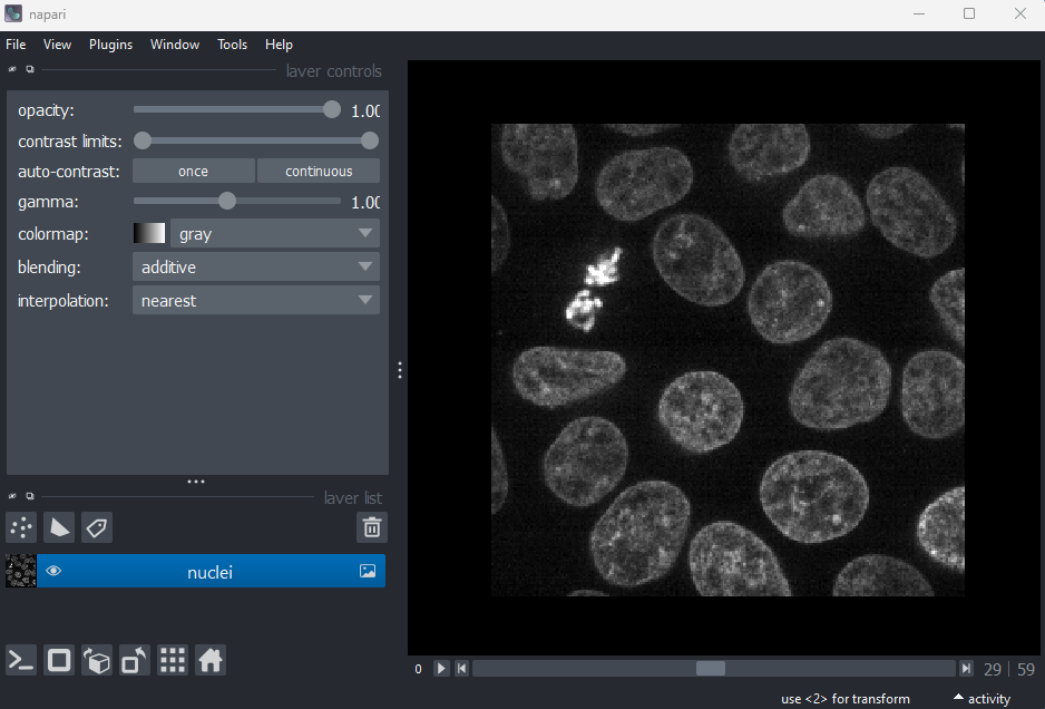
If you don’t have Napari’s ‘Cells (3D + 2Ch)’ image open, then open
it with:File > Open Sample > napari builtins > Cells (3D + 2Ch)
Make sure you only have ‘nuclei’ in the layer list. Select any
additional layers, then click the ![]() icon to remove them. Also, select the nuclei layer (should be
highlighted in blue), and change its colormap from ‘green’ to ‘gray’ in
the layer controls.
icon to remove them. Also, select the nuclei layer (should be
highlighted in blue), and change its colormap from ‘green’ to ‘gray’ in
the layer controls.
Now let’s look at how we can create a mask of the nuclei. Recall from the last episode, that a ‘mask’ is a segmentation with only two labels - background + your class of interest (in this case nuclei).
A simple approach to create a mask is to use a method called ‘thresholding’. Thresholding works best when there is a clear separation in pixel values between the class of interest and the rest of the image. In these cases, thresholding involves choosing one or more specific pixel values to use as the cut-off between background and your class of interest. For example, in this image, you could choose a pixel value of 100 and set all pixels with a value less than that as background, and all pixels with a value greater than that as nuclei. How do we go about choosing a good threshold though?
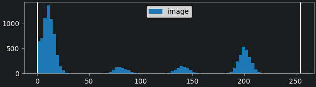
One common approach to choosing a threshold is to use the image
histogram - recall that we looked at histograms in detail in the image display episode. Let’s go ahead and
open a histogram with:Plugins > napari Matplotlib > Histogram
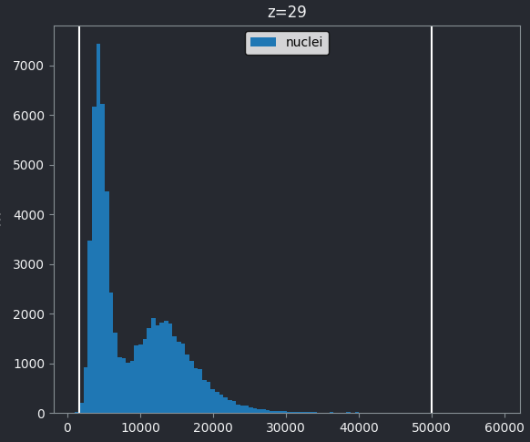
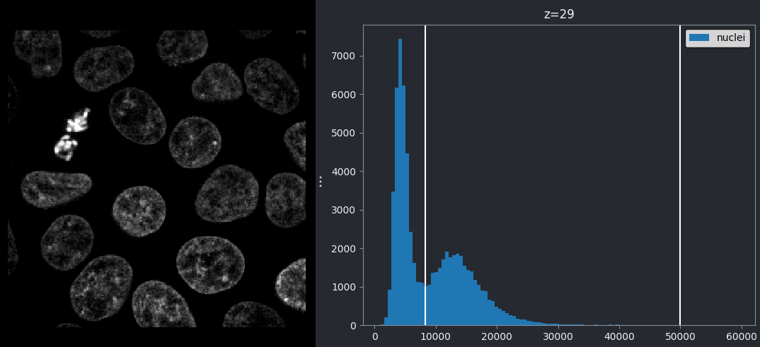
From this histogram, we can see two peaks - a larger one at low intensity, then a smaller one at higher intensity. Looking at the image, it would make sense if the lower intensity peak represented the background, with the higher one representing the nuclei. We can verify this by adjusting the contrast limits in the layer controls. If we move the left contrast limits node to the right of the low intensity peak (around 8266), we can still clearly see the nuclei:
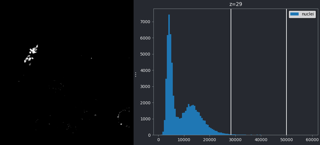
If we move the left contrast limits node to the right of the higher intensity peak (around 28263), most of the nuclei disappear from the image:
Recall that you can set specific values for the contrast limits by right clicking on the contrast limits slider in Napari.
This demonstrates that the higher intensity peak is the one we are interested in, and we should set our threshold accordingly.
We can set this threshold with some commands in Napari’s console:
PYTHON
# Get the image data for the nuclei
nuclei = viewer.layers["nuclei"].data
# Create mask with a threshold of 8266
mask = nuclei > 8266
# Add mask to the Napari viewer
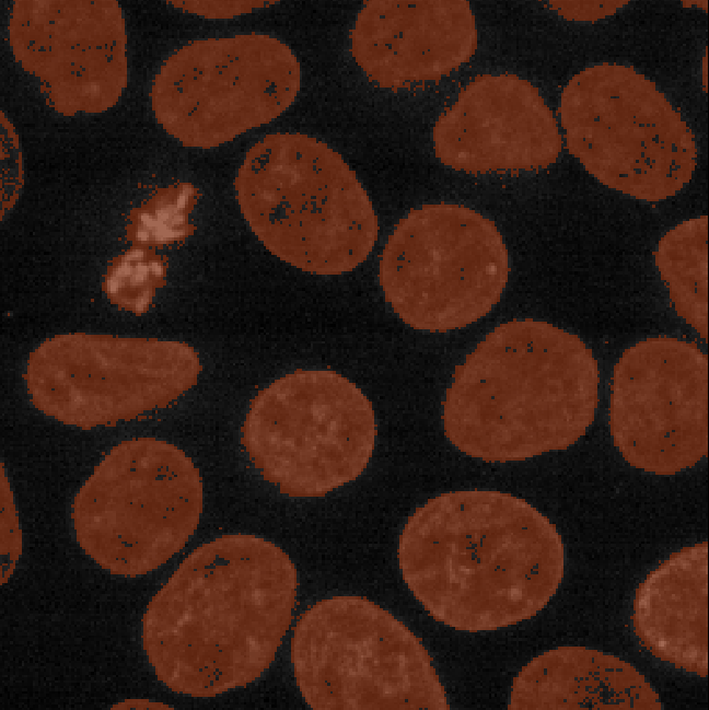
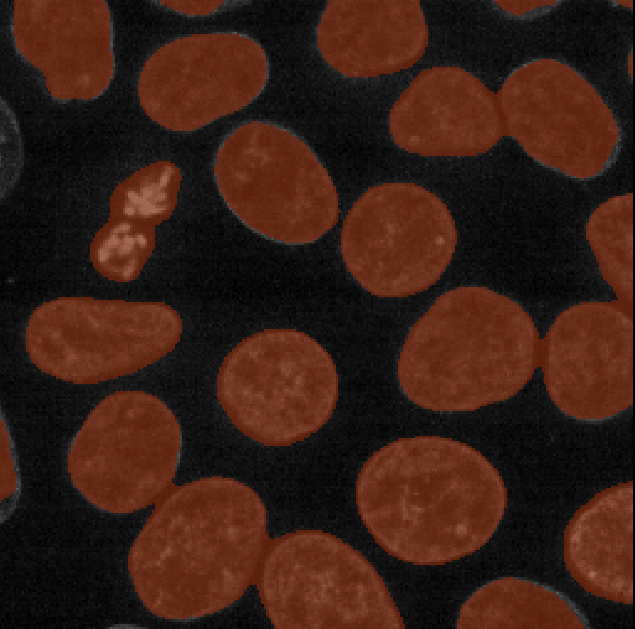
viewer.add_labels(mask)You should see a mask appear that highlights the nuclei in brown. If
we set the nuclei contrast limits back to normal (select ‘nuclei’ in the
layer list, then drag the left contrast limits node back to zero), then
toggle on/off the mask or nuclei layers with the ![]() icon, you
should see that the brown areas match the nucleus boundaries reasonably
well. They aren’t perfect though! The brown regions have a speckled
appearance where some regions inside nuclei aren’t labelled and some
areas in the background are incorrectly labelled.
icon, you
should see that the brown areas match the nucleus boundaries reasonably
well. They aren’t perfect though! The brown regions have a speckled
appearance where some regions inside nuclei aren’t labelled and some
areas in the background are incorrectly labelled.
This is mostly due to the presence of noise in our image (as we looked at in the choosing acquisition settings episode). For example, the dark image background isn’t completely uniform - there are random fluctuations in the pixel values giving it a ‘grainy’ appearance when we zoom in. These fluctuations in pixel value make it more difficult to set a threshold that fully separates the nuclei from the background. For example, background pixels that are brighter than average may exceed our threshold of 8266, while some nuclei pixels that are darker than average may fall below it. This is the main cause of the speckled appearance of some of our mask regions.
To improve the mask we must find a way to reduce these fluctuations in pixel value. This is usually achieved by blurring the image (also referred to as smoothing). We’ll look at this in detail later in the episode.
.add_labels() vs
.add_image
In the code blocks above, you will notice that we use
.add_labels(), rather than .add_image() as we
have in previous episodes. .add_labels() will ensure our
mask is added as a Labels layer, giving us access to all
the annotation tools and settings for segmentations (as covered in the
manual
segmentation episode). add_image() would create a
standard Image layer, which doesn’t give us easy access to
the annotation tools.
Manual thresholds
In this exercise, we’ll practice choosing manual thresholds based on an image’s histogram. For this, we’ll use a simple test image containing three shapes (rectangle, circle and triangle) with different mean intensities.
Copy and paste the following into Napari’s console to generate and load this test image:
PYTHON
import numpy as np
import skimage
from skimage.draw import disk, polygon
from skimage.util import random_noise, img_as_ubyte
from packaging import version

image = np.full((100, 100), 10, dtype="uint8")
image[10:50, 20:80] = 200
image[disk((75, 75), 15)] = 140
rr, cc = polygon([90, 60, 90], [10, 30, 50])
image[rr, cc] = 80
if version.parse(skimage.__version__) < version.parse("0.21"):
  image = img_as_ubyte(random_noise(image, var=0.0005, seed=6))
else:
  image = img_as_ubyte(random_noise(image, var=0.0005, rng=6))
viewer.add_image(image)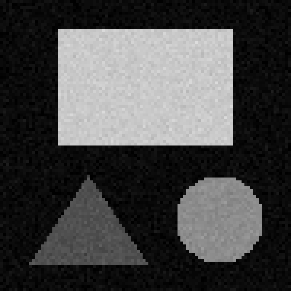
Create a mask for each shape by choosing thresholds based on the image’s histogram. You can set a threshold as all pixels above a certain value:
Or all pixels below a certain value:
Or all pixels between two values:
First, we show a histogram for the image by selecting the ‘image’
layer, then:Plugins > napari Matplotlib > Histogram
By moving the left contrast limits node we can figure out what each peak represents. You should see that the peaks from left to right are:
- background
- triangle
- circle
- rectangle
Then we set thresholds for each (as below). Note that you may not have exactly the same threshold values as we use here! There are many different values that can give good results, as long as they fall in the gaps between the peaks in the image histogram.
Adding plugins to help with segmentation
Fortunately for us, segmenting images in the presence of noise is a widely studied problem, so there are a many existing plugins we can install to help. If you need a refresher on the details of how to find and install plugins in Napari, see the image display episode.
We will use the napari-skimage
plugin, which adds many features that can aid with image segmentation
and other image processing tasks.
In the top menu-bar of Napari select:Plugins > Install/Uninstall Plugins...
Then search for napari-skimage and click the blue button
labelled ‘install’. Wait for the installation to complete.
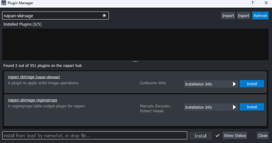
Once the plugin is installed, you will need to close and re-open Napari.
Filters
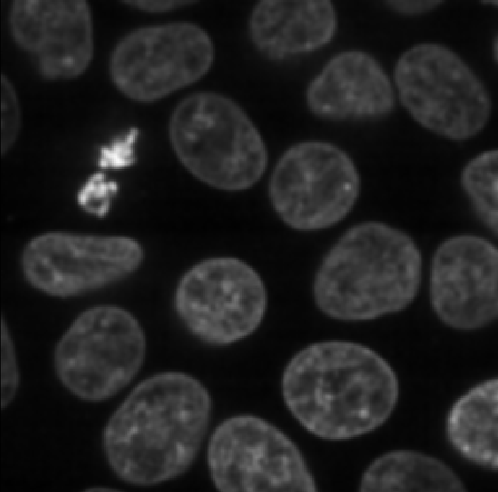
Let’s open the cells image in Napari again:File > Open Sample > napari builtins > Cells (3D + 2Ch)
As before, make sure you only have ‘nuclei’ in the layer list. Select
any additional layers, then click the ![]() icon to remove them. Also, select the nuclei layer (should be
highlighted in blue), and change its colormap from ‘green’ to ‘gray’ in
the layer controls.
icon to remove them. Also, select the nuclei layer (should be
highlighted in blue), and change its colormap from ‘green’ to ‘gray’ in
the layer controls.

With the new plugin installed, you should see many new options under
Layers in the top menu-bar of Napari. You can find out more
about these options using the plugin’s
documentation.
For now, we are interested in the gaussian blur under:Layers > Filter > Filtering > Gaussian filter (napari-skimage)
If you click on this option, you should see a new panel appear on the right side of Napari:
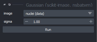
Make sure you have ‘nuclei’ selected on the ‘image’ row, then click ‘Apply Gaussian Filter’:
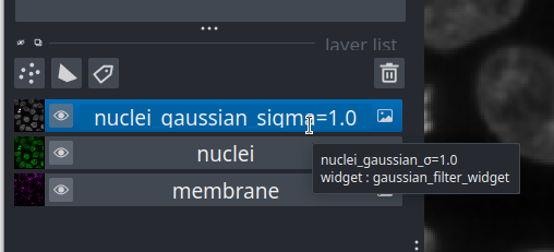
You should see a new image appear in the layer list called ‘nuclei_gaussian_σ=1.0’, which is a slightly blurred version of the original nuclei image.
Try increasing the ‘sigma’ value to three and clicking run again:
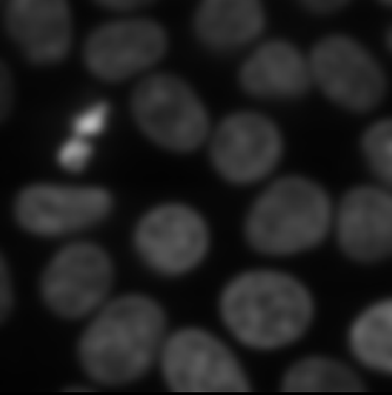
You should see a new ‘nuclei_gaussian_σ=3.0’ layer that is much more heavily blurred.
Renaming Layer Names
The Gaussian filter plugin uses the special character σ
in the layer names. This naming convention makes it difficult to type
layer names in the Napari console (unless your keyboard has the
σ character). To make life easier change the name of the
added layer now. Double click on the layer name, delete σ
and change it to sigma
Similarly, if you used the +/- buttons to
set the sigma value, you may see excessive decimal places in the layer
name e.g. nuclei_gaussian_σ=3.00000000000000. If so, double
click on the layer name to re-name it to
nuclei_gaussian_sigma=3.0.
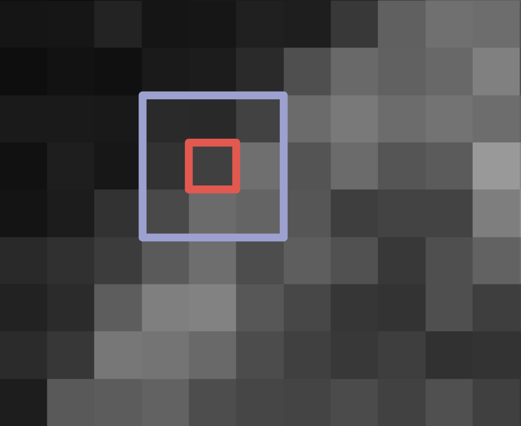
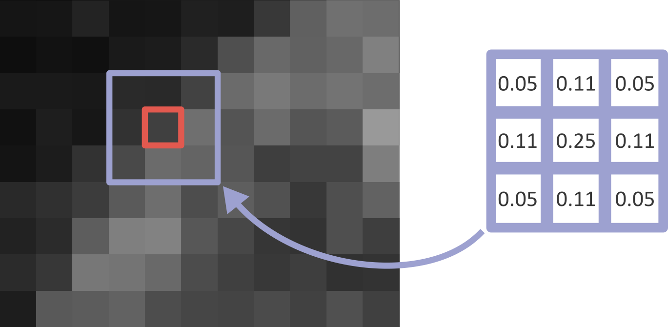
What’s happening here? What exactly does a gaussian blur do? A gaussian blur is an example of a ‘linear filter’ which is used to manipulate pixel values in images. When a filter is applied to an image, each pixel value is replaced by some combination of the pixel values around it. For example, below is shown a small, zoomed-in area of the nucleus image. Here, the value of the red pixel could be affected by all values within the displayed 3x3 box:
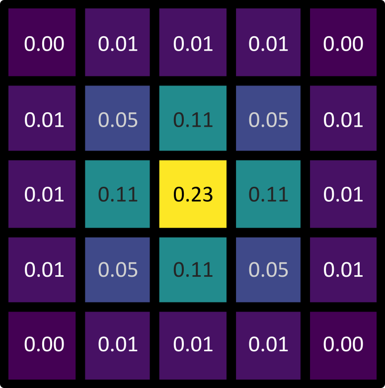
Exactly what this effect is, and the size of the region it involves, is controlled by the filter’s ‘kernel’. The kernel can be thought of as another very small image, where the pixel values control the effect of the filter. An example 3x3 kernel is shown below:
While the above image uses a 3x3 kernel, they can have many different sizes! Kernels tend to be odd in size: 3x3, 5x5, 9x9, etc. This is to allow the current pixel that you will be replacing to lie perfectly at the centre of the kernel, with equal spacing on all sides.
To determine the new value of a pixel (like the red pixel above), the kernel is placed over the target image centred on the pixel of interest. Then, for each position in the kernel, we multiply the image pixel value with the kernel pixel value. For the 3x3 kernel example above, we multiply the image pixel value one above and one to the left of our current pixel with the pixel value in the top left position of the kernel. Then we multiply the value for the pixel just above our current pixel with the top middle kernel value and so on… The result of the nine multiplications in each of the nine positions of this kernel are then summed together to give the new value of the central pixel. To process an entire image, the kernel is moved across the image pixel by pixel calculating the new value at each location. Pete Bankhead’s bioimage book has a really nice animation of this process , which is worth taking a look at.
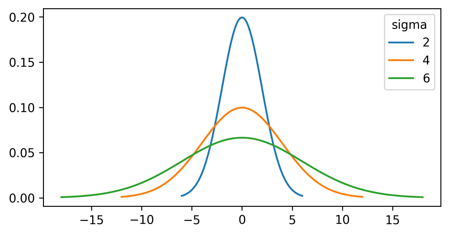
For the gaussian filter we looked at above, the values in the kernel are based on a ‘gaussian function’. A gaussian function creates a central peak that reduces in height as we move further away from the centre. The shape of the peak can be adjusted using different values of ‘sigma’ (the standard deviation of the function), with larger sigma values resulting in a wider peak:
For a gaussian filter, the values are based on a 2D gaussian function. This gives similar results to the plot above (showing a 1D gaussian function) with a clear central peak, but now the height decreases in both x and y:
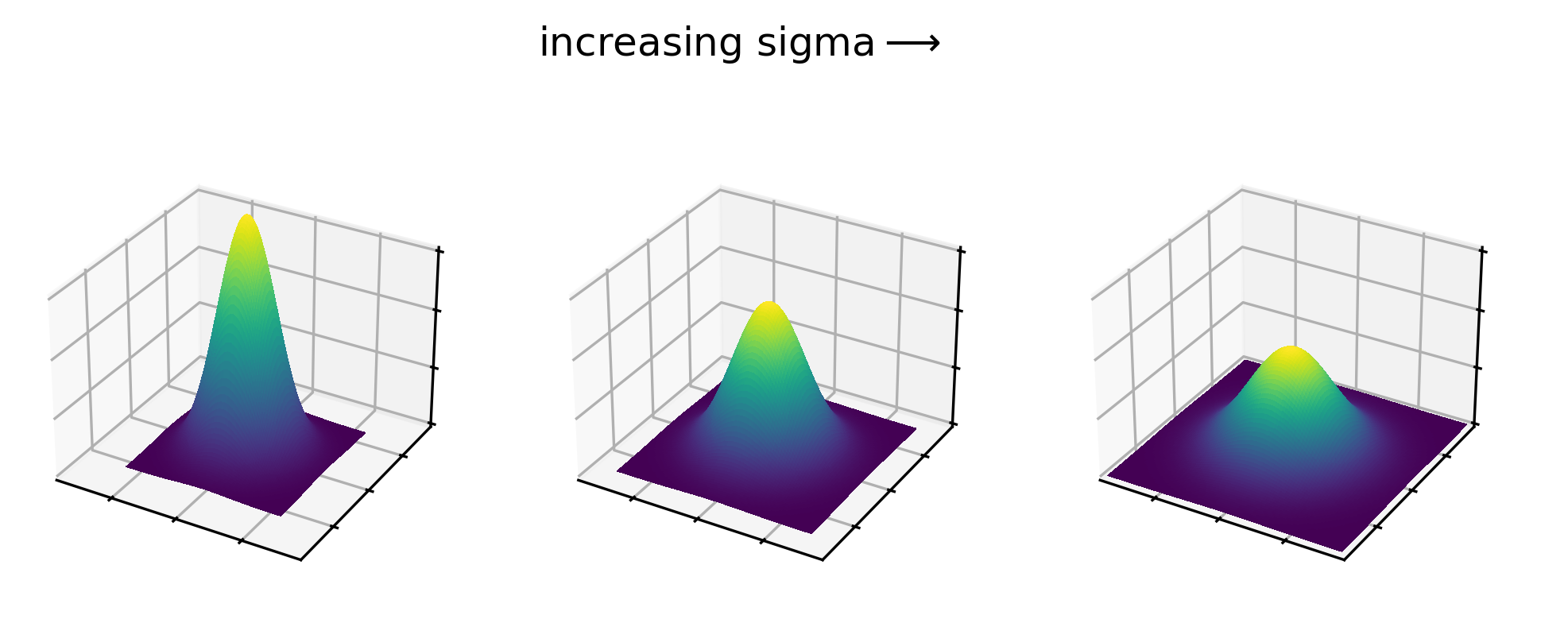
Gaussian kernels show this same pattern, with values highest at the centre that decrease as we move further away. See the example 5x5 kernel below:
The gaussian filter causes blurring (also known as smoothing), as it is equivalent to taking a weighted average of all pixel values within its boundaries. In a weighted average, some values contribute more to the final result than others. This is determined by their ‘weight’, with a higher weight resulting in a larger contribution to the result. As a gaussian kernel has its highest weights at the centre, this means that a gaussian filter produces an average where central pixels contribute more than those further away.
Larger sigma values result in larger kernels, which average larger
areas of the image. For example, the scikit-image
implementation we are currently using truncates the kernel after four
standard deviations (sigma). This means that the blurring effect of the
gaussian filter is enhanced with larger sigma, but will also take longer
to calculate. This is a general feature of kernels for different types
of filter - larger kernels tend to result in a stronger effect at the
cost of increased compute time. This time can become significant when
processing very large images in large quantities.
If you want more information about how filters work, both the data carpentry image processing lesson and Pete Bankhead’s bioimage book have chapters going into great detail. Note that here we have focused on ‘linear’ filters, but there are many types of ‘non-linear’ filter that process pixel values in different ways.
Sigma vs full width at half maximum (FWHM)
In this episode, we have focused on the gaussian function’s standard deviation (sigma) as the main way to control the width of the central peak. Some image analysis packages will instead use a measure called the ‘full width at half maximum’ or FWHM. The FWHM is the width of the curve at half of its maximum value (see the diagram below):
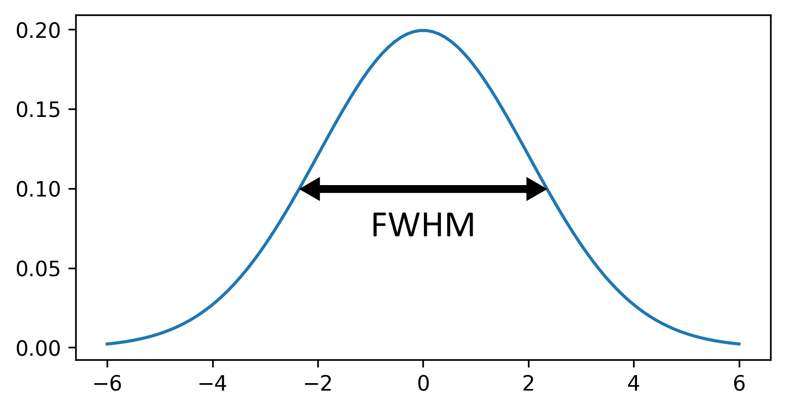
Similar to increasing sigma, a higher FWHM will result in a wider peak. Note that there is a clear relationship between sigma and FWHM where:
\[\large FWHM = sigma\sqrt{8ln(2)}\]
Filters
Try some of the other filters included with the
napari-skimage plugin. Some of these only support 2D images
for now (the plugin is still being actively updated - so more 3D support
should be added soon).
Create a 2D image by running the following in the console:
Try the following filters (make sure you use ‘nuclei_2D’ in the image field):
What does
Layers > Filter > Filtering > Median filter (napari skimage)do? How does it compare to the gaussian filter we used earlier?What does
Layers > Filter > Edge detection > Farid filter (napari skimage)do?-
What does
Layers > Filter > Filtering > Rank filters (napari skimage)do?- Try a ‘Filter Type’ of ‘Maximum` and ’Minimum’ + compare
- (you may say see a warning relating to bin number when you run this - this can be ignored)
If you’re not sure what the effect is, try searching for the filter’s name online.
Median
The median filter creates a blurred version of the input image. Larger values for the ‘Footprint size’ result in a greater blurring effect.
The results of the median filter are similar to a gaussian blur, but tend to preserve the edges of objects better. For example, here you can see that it preserves the sharp edges of each nucleus. You can read more about how the median filter works in Pete Bankhead’s bioimage book.
Farid
Farid is a type of filter used to detect the edges of objects in an image. For example, for the nuclei image it gives bright rings around each nucleus, as well as around some of the brighter patches inside the nuclei.
Thresholding the blurred image
First, let’s clean up our layer list. Make sure you only have the
nuclei and nuclei_gaussian_sigma=3.0 layers in
the layer list - select any others and remove them by clicking the ![]() icon. Close all filter settings panels on the right side of Napari
(apart from the gaussian settings) by clicking the tiny
icon. Close all filter settings panels on the right side of Napari
(apart from the gaussian settings) by clicking the tiny X
icon at their top left corner.
If you don’t have the nuclei_gaussian_sigma=3.0 in your
layer list then make it now using the Gaussian Filter with sigma set to
three. You may need to rename the layer, replacing σ with
sigma.
Now let’s try thresholding our image again. We’ll apply the same
threshold as before, now to the nuclei_gaussian_sigma=3.0
layer:
PYTHON
# Get the image data for the blurred nuclei
blurred = viewer.layers["nuclei_gaussian_sigma=3.0"].data

# Create mask with a threshold of 8266
blurred_mask = blurred > 8266

# Add mask to the Napari viewer
viewer.add_labels(blurred_mask)
You’ll see that we get an odd result - a totally empty image! What went wrong here? Let’s look at the blurred image’s shape and data type in the console:
OUTPUT
(60, 256, 256)
float64
The shape is as expected, but what happened to the data type! It’s now a 64-bit float image (rather than the usual unsigned integer 8-bit/16-bit for images). Recall from the ‘What is an image?’ episode that float images allow values with a decimal point to be stored e.g. 3.14.
Many image processing operations will convert images to
float32 or float64, to provide the highest
precision possible. For example, imagine you have an unsigned-integer
8-bit image with pixel values of all 75. If you divided by two to give
37.5, then these values would all be rounded to 38 when stored (as
uint8 can’t store decimal numbers). Only by converting to a
different data type (float) could we store the exact value of this
operation. In addition, by having the highest bit-depth (64-bit), we
ensure the highest possible precision which can be useful to avoid
slight errors after multiple operations are applied one after the other.
In summary, changes in data type are expected in image processing, and
it’s good to keep an eye out for when this is required!
Let’s return to thresholding our image. Close the gaussian panel by
clicking the tiny X icon at its top left corner. Then
select the ‘blurred_mask’ in the layer list and remove it by clicking
the ![]() icon. Finally, open the
icon. Finally, open the napari-matplotlib histogram again
with:Plugins > napari Matplotlib > Histogram
Make sure you have ‘nuclei_gaussian_sigma=3.0’ selected in the layer list (should be highlighted in blue).
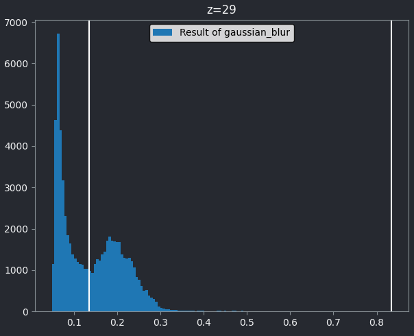
You should see that this histogram now runs from 0 to 1, reflecting the new values after the gaussian blur and its new data type. Let’s again choose a threshold between the two peaks - around 0.134:
PYTHON
# Get the image data for the blurred nuclei
blurred = viewer.layers["nuclei_gaussian_sigma=3.0"].data

# Create mask with a threshold of 0.134
blurred_mask = blurred > 0.134

# Add mask to the Napari viewer
viewer.add_labels(blurred_mask)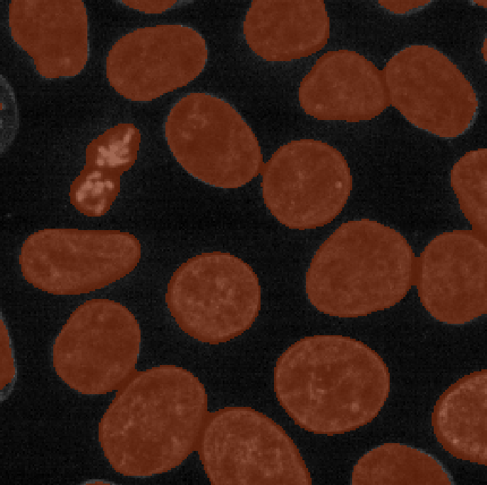
Now we see a much more sensible result - a brown mask that again highlights the nuclei in brown. To compare to the result with no smoothing, let’s run our previous threshold again (from the earlier thresholding section):
PYTHON
# Get the image data for the nuclei
nuclei = viewer.layers["nuclei"].data

# Create mask with a threshold of 8266
mask = nuclei > 8266

# Add mask to the Napari viewer
viewer.add_labels(mask)
If we compare ‘blurred_mask’ and ‘mask’, we can see that blurring before choosing a threshold results in a much smoother result that has fewer areas inside nuclei that aren’t labelled, as well as fewer areas of the background that are incorrectly labelled.
This workflow of blurring an image then thresholding it is a very common method to provide a smoother, more complete mask. Note that it still isn’t perfect! If you browse through the z slices with the slider at the bottom of the image, it’s clear that some areas are still missed or incorrectly labelled.
Automated thresholding
First, let’s clean up our layer list again. Make sure you only have
the ‘nuclei’, ‘mask’, ‘blurred_mask’ and ‘nuclei_gaussian_sigma=3.0’
layers in the layer list - select any others and remove them by clicking
the ![]() icon. Then, if you still have the
icon. Then, if you still have the napari-matplotlib
histogram open, close it by clicking the tiny x icon in the
top left corner.
So far we have chosen our threshold manually by looking at the image
histogram, but it would be better to find an automated method to do this
for us. Many such methods exist - for example, open
Layers > Filter > Thresholding > Automated Threshold (napari skimage).
One of the most common methods is Otsu thresholding, which we
will look at now.
Let’s go ahead and apply this to our blurred image:
- Select ‘nuclei_gaussian_sigma=3.0’ in the
Imagerow - Select ‘otsu’ as the method
- Click the ‘Apply Thresholding’ button
This should produce a mask (in a new layer ending with
‘threshold_otsu’) that is very similar to the one we created with a
manual threshold. To make it easier to compare, we can rename some of
our layers by double clicking on their name in the layer list - for
example, rename ‘mask’ to ‘manual_mask’, ‘blurred_mask’ to
‘manual_blurred_mask’, and ‘…threshold_otsu’ to ‘otsu_blurred_mask’.
Recall that you can change the colour of a mask by clicking the ![]() icon in
the top row of the layer controls. By toggling on/off the relevant
icon in
the top row of the layer controls. By toggling on/off the relevant ![]() icons, you
should see that Otsu chooses a slightly different threshold than we did
in our ‘manual_blurred_mask’, labelling slightly smaller regions as
nuclei in the final result.
icons, you
should see that Otsu chooses a slightly different threshold than we did
in our ‘manual_blurred_mask’, labelling slightly smaller regions as
nuclei in the final result.
How is Otsu finding the correct threshold? The details are rather complex, but to summarise - Otsu’s method is trying to find a threshold that minimises the spread of pixel values in both the background and your class of interest. In effect, it’s trying to find two peaks in the image histogram and place a threshold in between them.
This means it’s most suitable for images that show two clear peaks in their histogram (also known as a ‘bimodal’ histogram). Other images may require different automated thresholding methods to produce a good result.
Automated thresholding
For this exercise, we’ll use the same example image as the manual thresholding exercise. If you don’t have that image open, run the top code block in that exercise to open the image:
Try some of the other automatic thresholding options provided by the
napari-skimage plugin. Set the ‘method’ to different
options in
Layers > Filter > Thresholding > Automated Threshold (napari skimage)
Try:
meanyenlisauvola
How do they compare to otsu thresholding?
Recall that you can change the colour of a mask by clicking the ![]() icon in
the top row of the layer controls.
icon in
the top row of the layer controls.
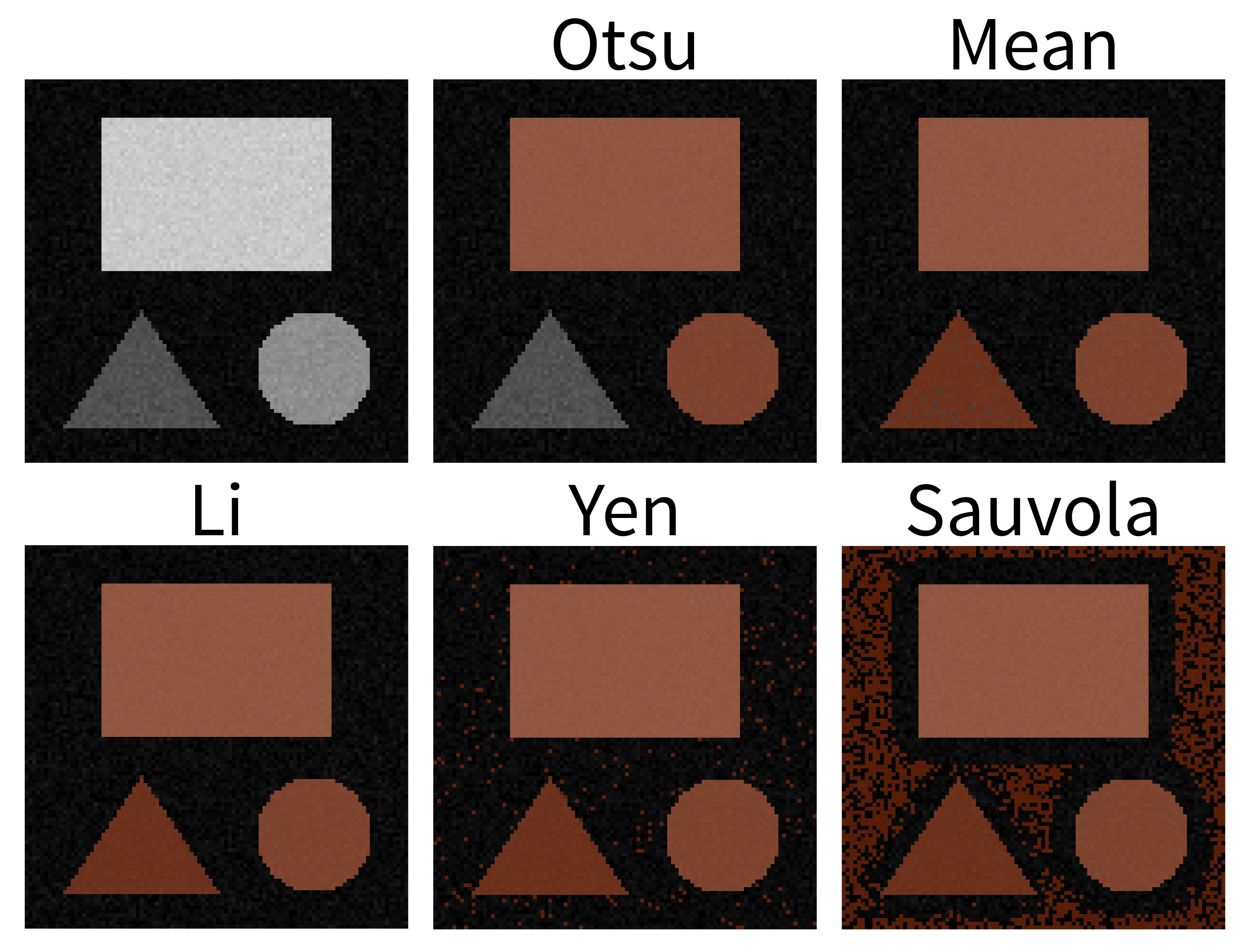
- Otsu: The mask does not include the low‑intensity triangle.
- Mean: Generally good, but on close inspection a few darker triangle pixels are still missed.
- Li: This looks great! The mask includes all pixels of the three shapes, while excluding the background.
- Yen: Includes the shapes but also includes some background.
- Sauvola: A substantial amount of background is included here.
The important point is that different automatic thresholding methods will work well for different kinds of images, and depending on which part of an image you are trying to segment. It’s worth trying a variety of options on your images to see which performs best for your specific dataset.
Summary
To summarise, here are some of the main steps you can use to make a mask:
- Quality control
- Blur the image
- Threshold the image
There are many variations on this standard workflow e.g. different filters could be used to blur the image (or in general to remove noise), different methods could be used to automatically find a good threshold… There’s also a wide variety of post processing steps you could use to make your mask as clean as possible. We’ll look at some of these options in the next episode.
Thresholding is simply choosing a specific pixel value to use as the cut-off between background and your class of interest.
Thresholds can be chosen manually based on the image histogram
Thresholds can be chosen automatically with various methods e.g. Otsu
Filters modify pixel values in an image by using a specific ‘kernel’
Gaussian filters are useful to blur an image before thresholding. The ‘sigma’ controls the strength of the blurring effect.
Image processing operations may modify the data type of your image - often converting it to
float32orfloat64.